Nexlinje Logistics
Nexlinje Logistics is a modern logistics company committed to providing fast, secure, reliable, and seamless logistics solutions for businesses and individuals. With a focus on technology and innovation, the brand caters to businesses seeking simple logistics solutions, seamless global deliveries, warehousing, and distribution services. Nexlinje Logistics aims to redefine industry standards by combining cutting-edge technology with a customer-focused approach, ensuring speed, transparency, and trust in every delivery.
Role
- Brand strategy
- Logo design & visual identity
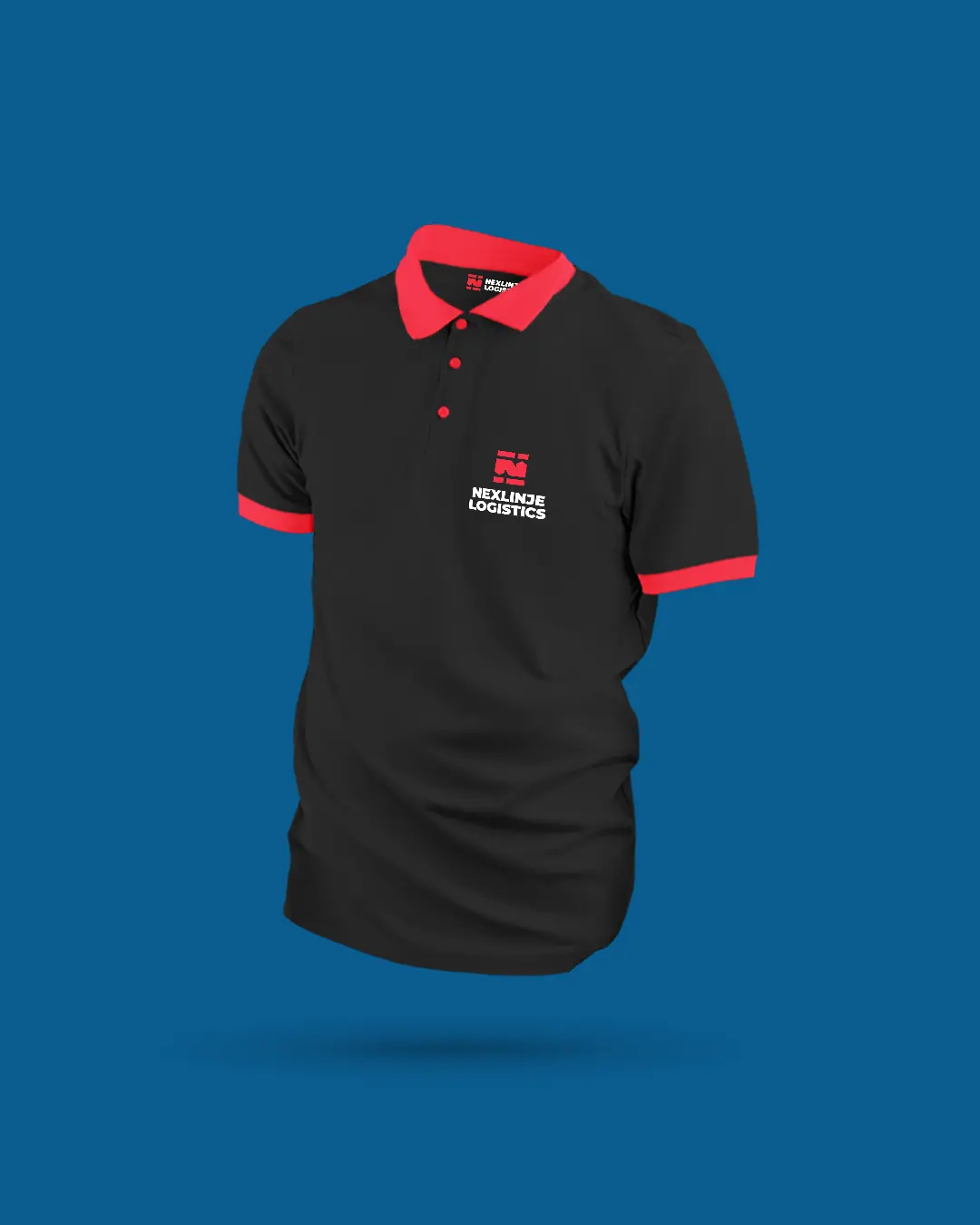
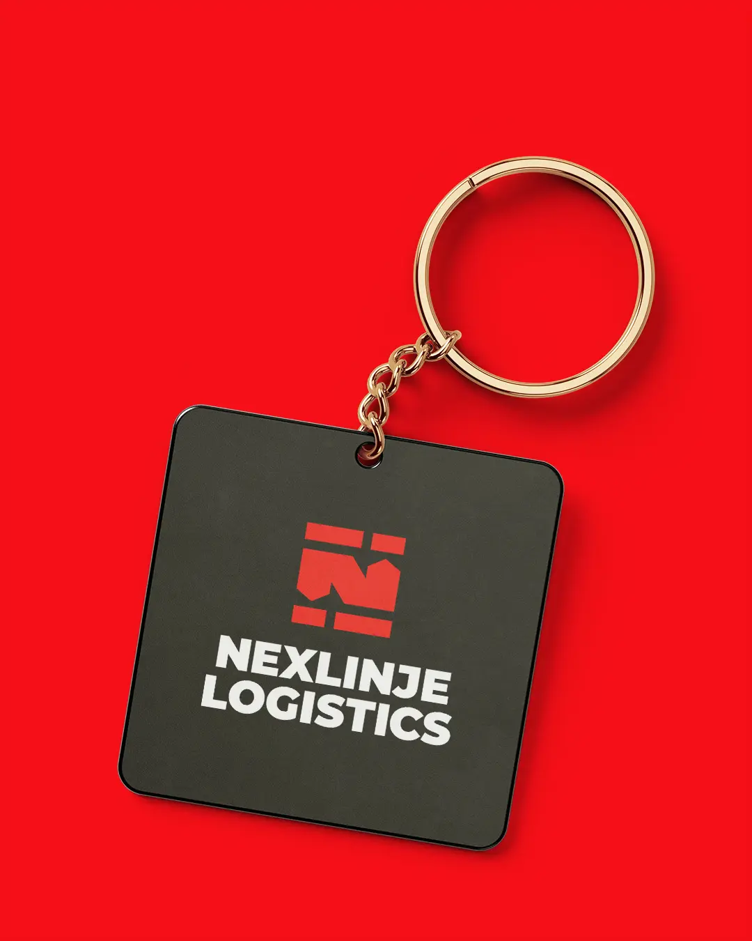
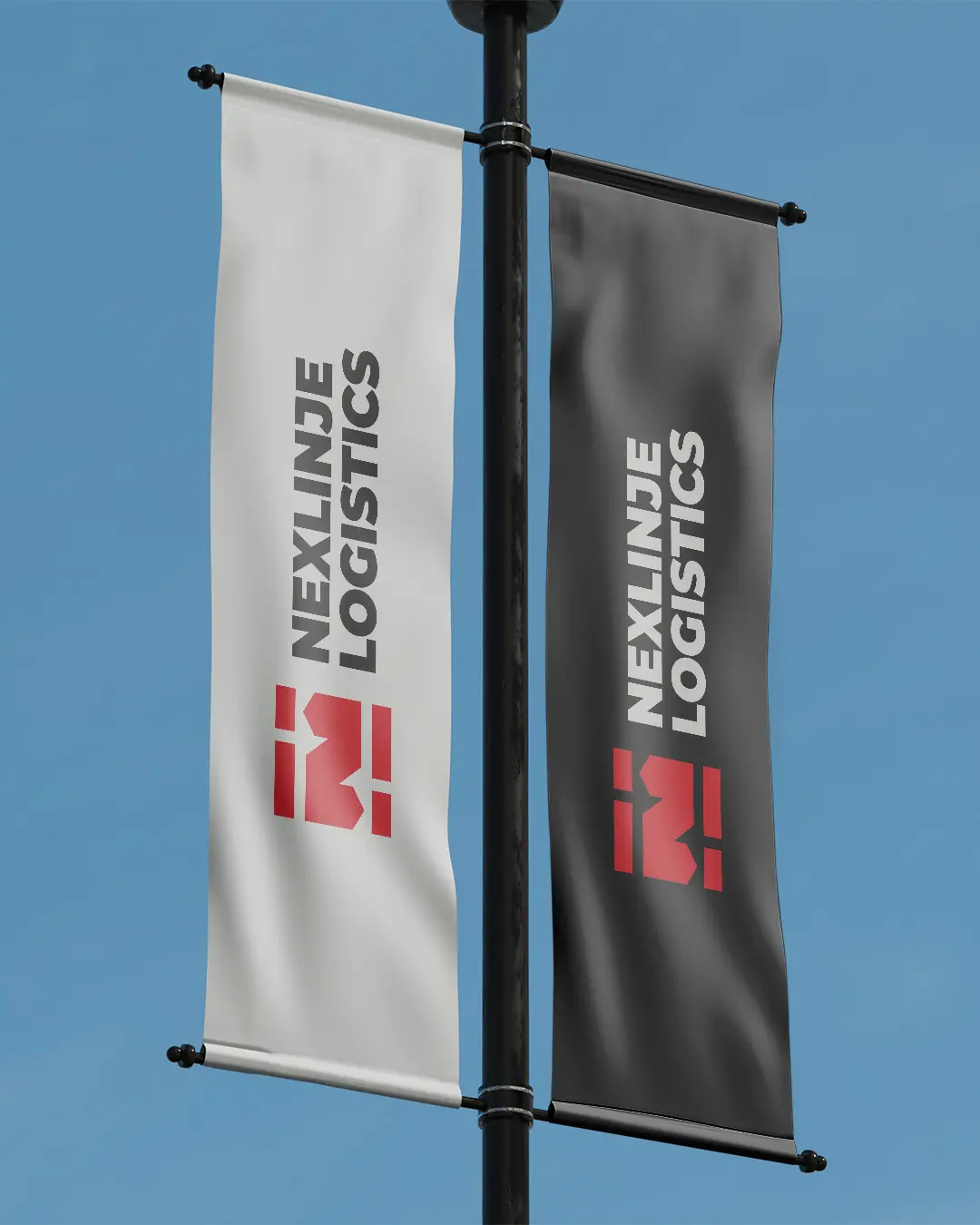
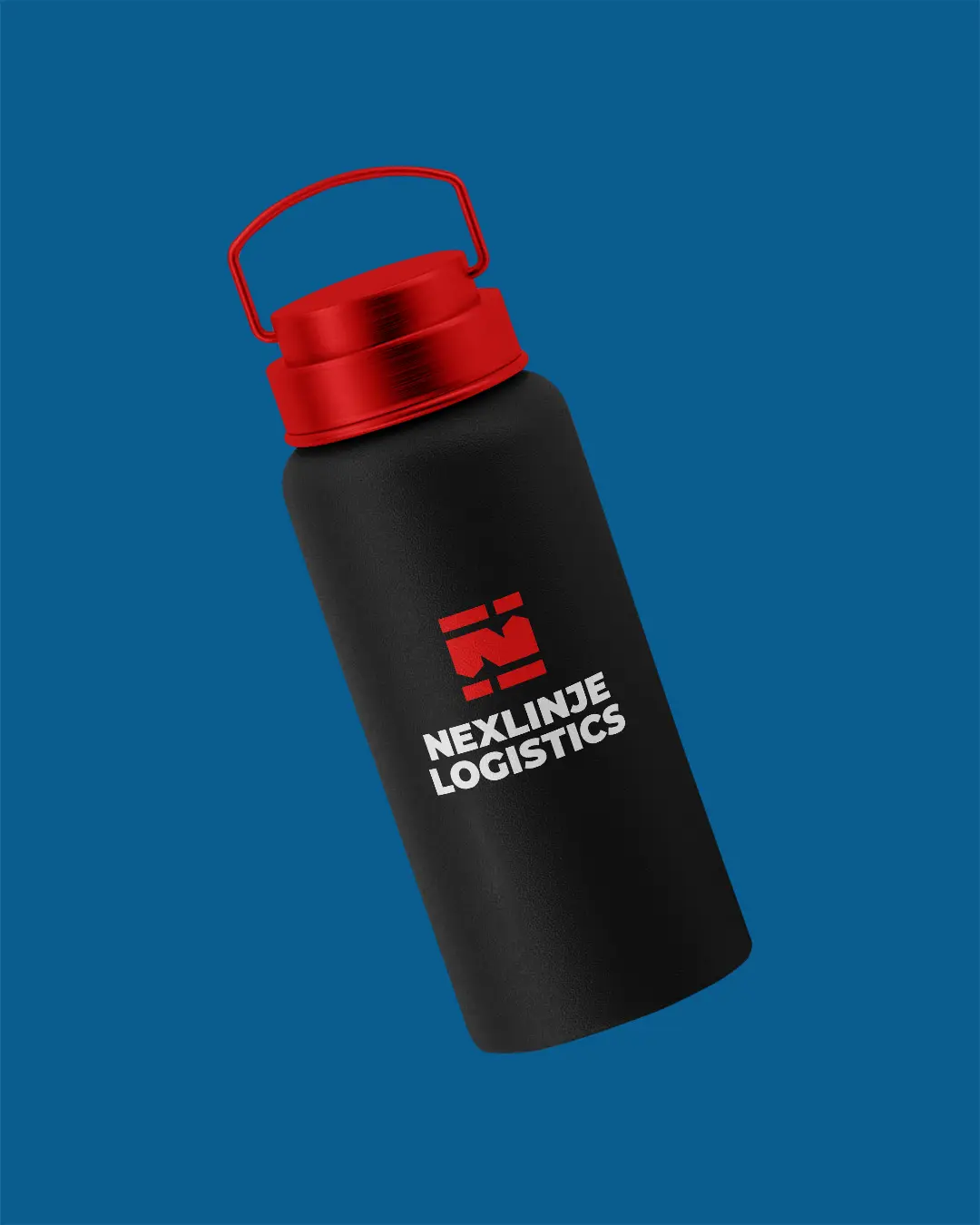
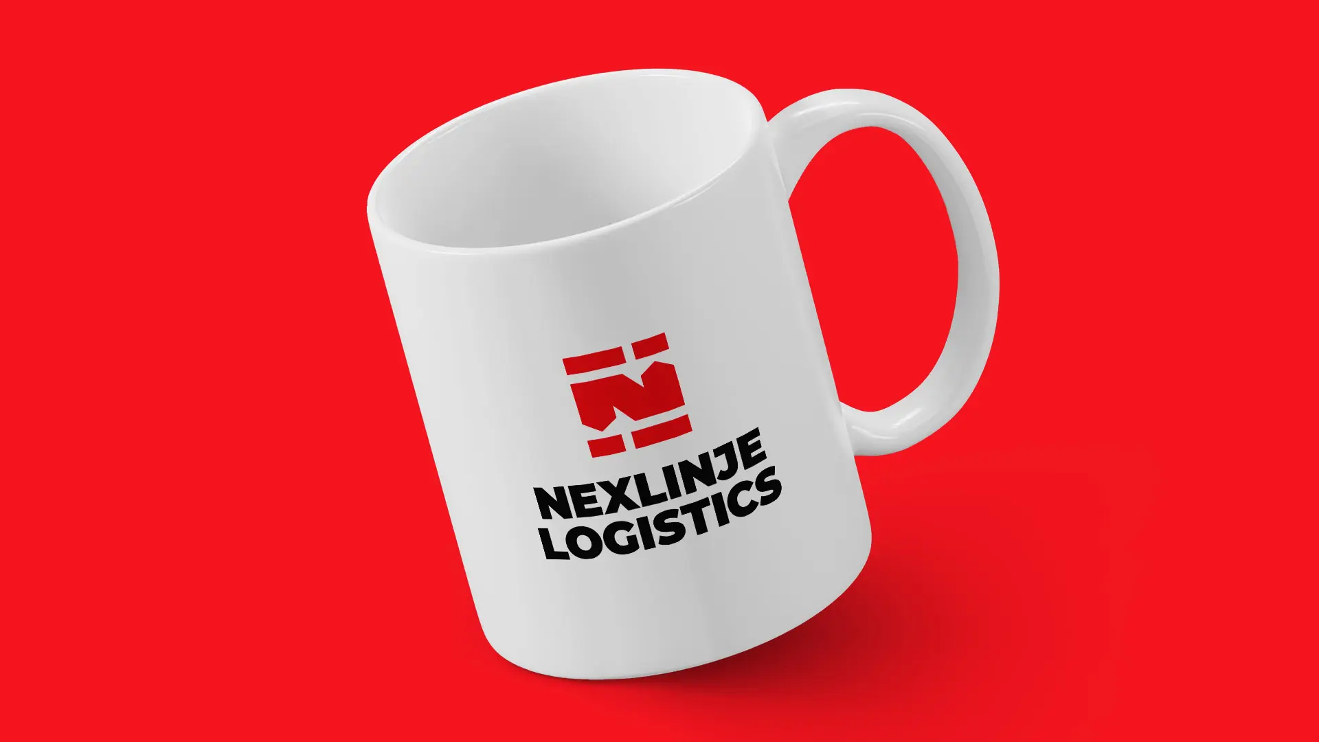
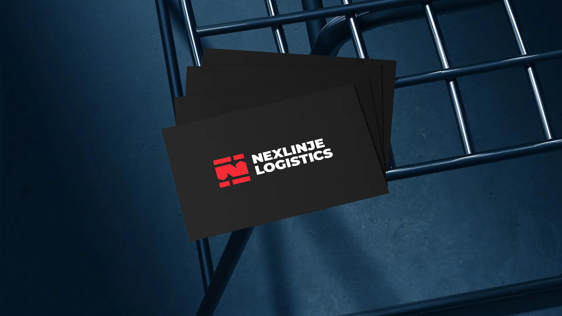
- Brand collaterals
The Challenge
Nexlinje Logistics needed more than just a logo… it needed a full brand identity capable of earning trust, signaling professionalism, and communicating its core values at a glance. The identity had to work hard from day one… bold enough to stand out, credible enough to be trusted, and dynamic enough to reflect a brand always in motion.
The Solution
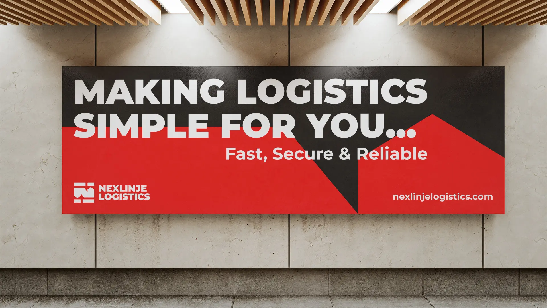
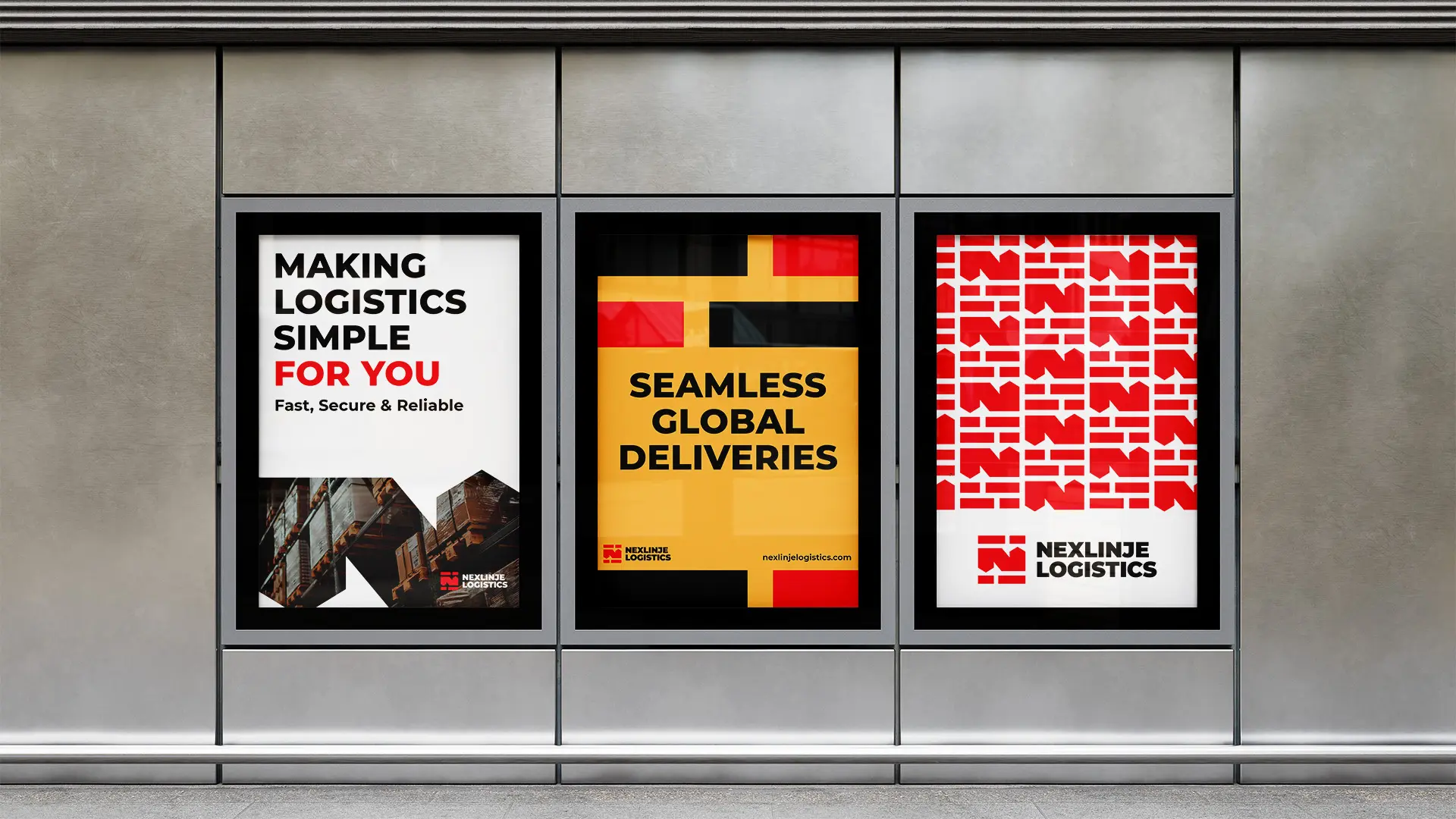
A bold and dynamic brand identity system was built to reflect exactly what Nexlinje Logistics delivers… speed, precision, reliability, and trust. Every visual decision was made with purpose, ensuring the brand communicates its values clearly and consistently across every touchpoint.
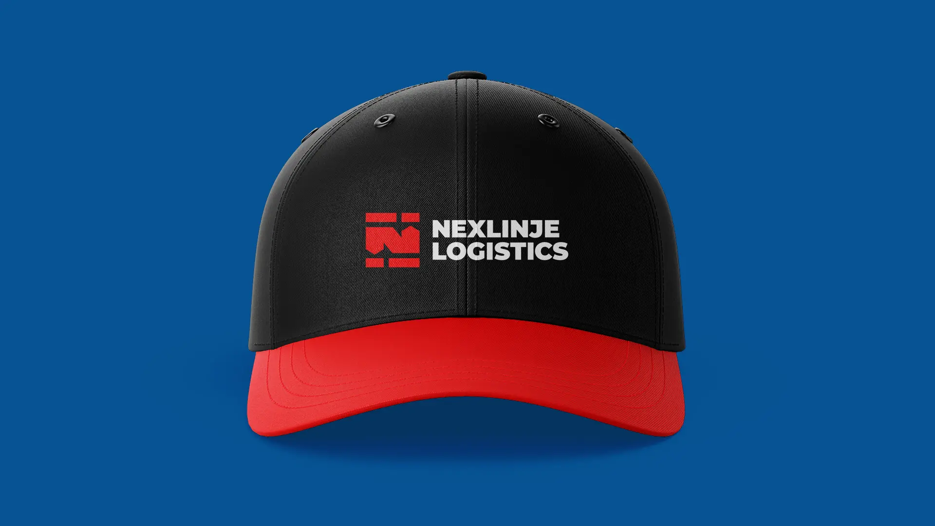
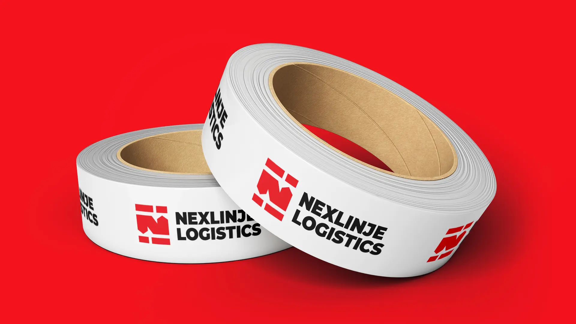
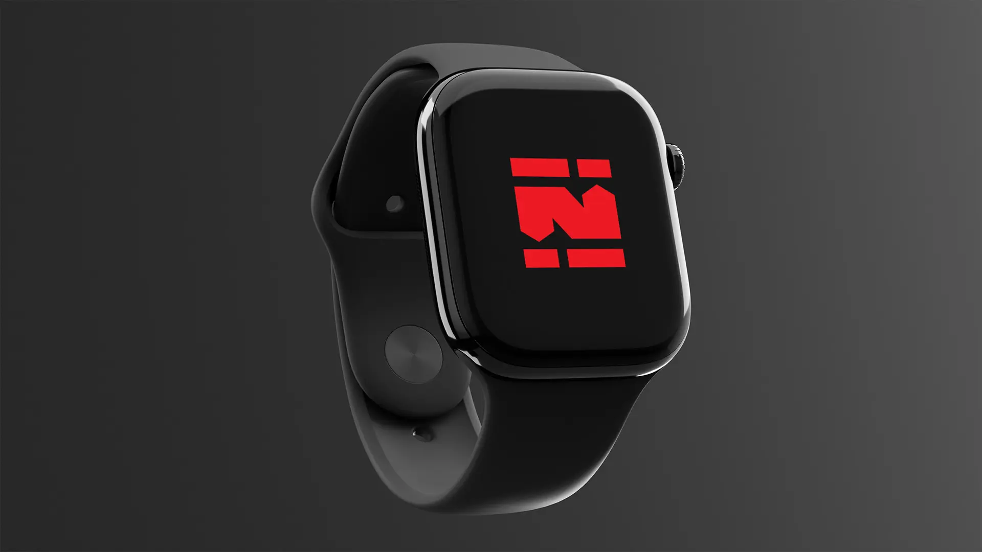
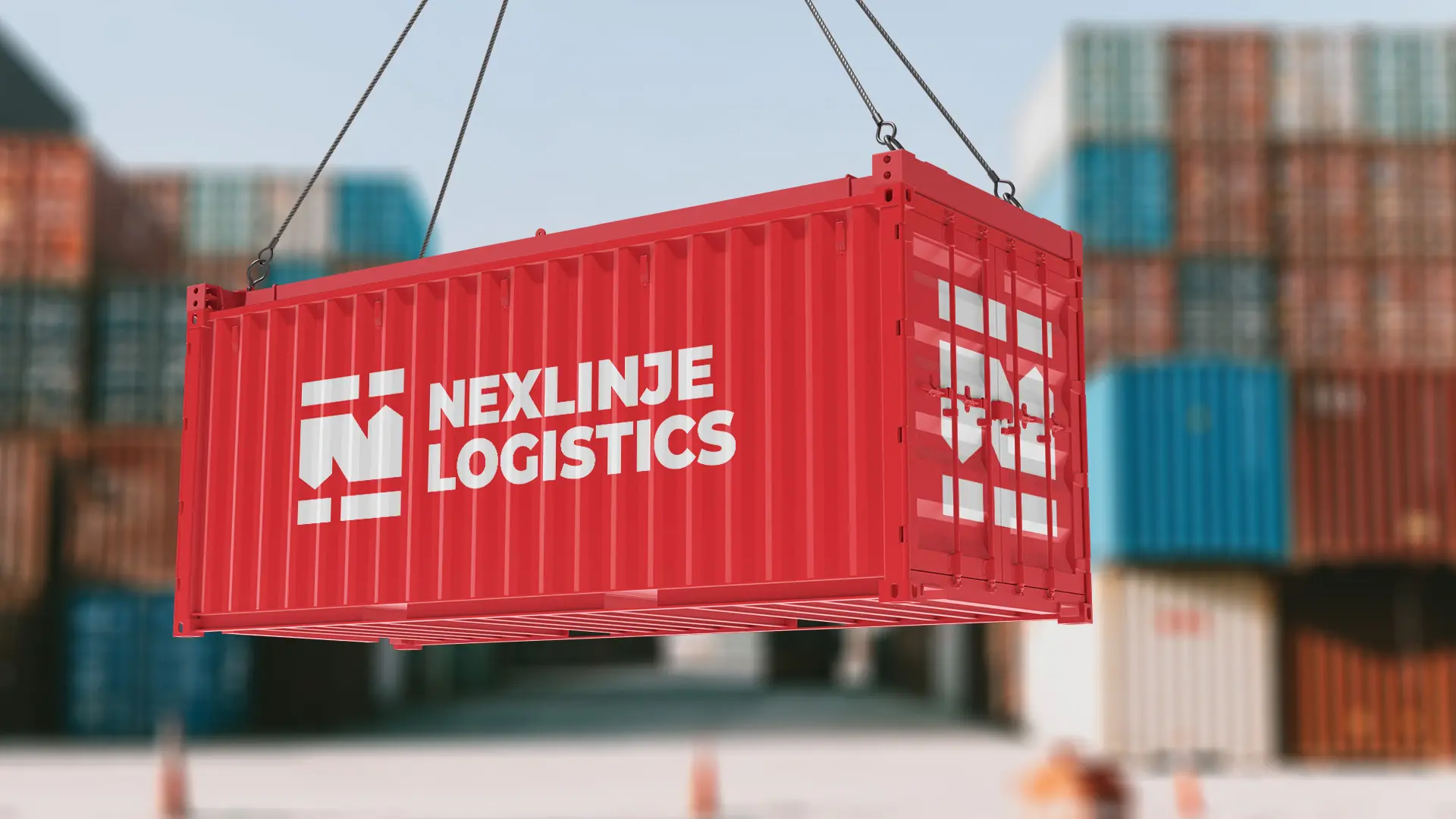
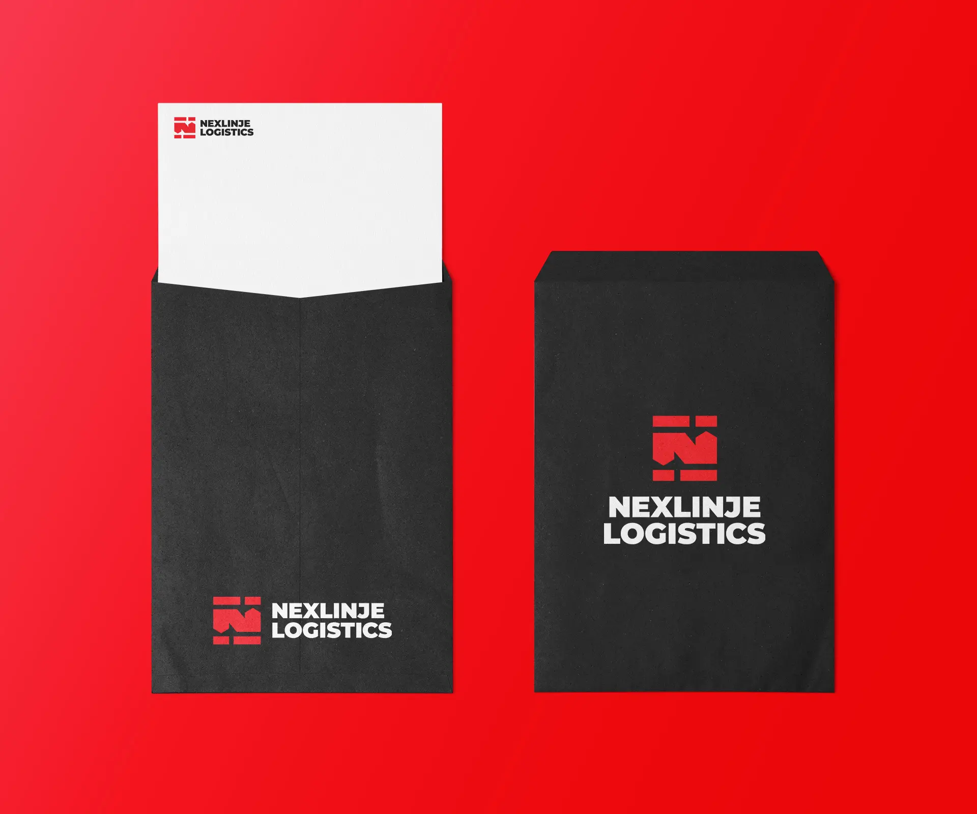
Logo design: The primary Nexlinje Logistics logo is a combination mark strategically designed to be bold, creative, and stand out. The concept of the brand mark conveys what the brand stands for – speed, boldness, shipping, streamlined process, seamless delivery, transportation, reliability, and trust. The logo mark depicts “timely delivery of goods from one point to another”… The “N” shape represents the first letter of the brand name “Nexlinje”… The rectangle shapes depict “to and fro movement of a cargo truck” and “front and side view of shipping containers”… The rectangle shapes, which resemble thick dashed lines, represent speed and streamlined process… The hidden “up and down arrows” in the negative space of the N and rectangle shapes represent the continuous movement of goods.
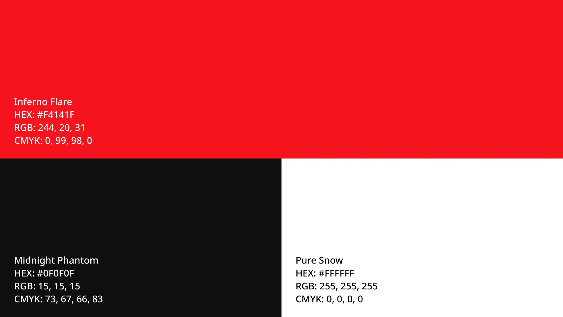
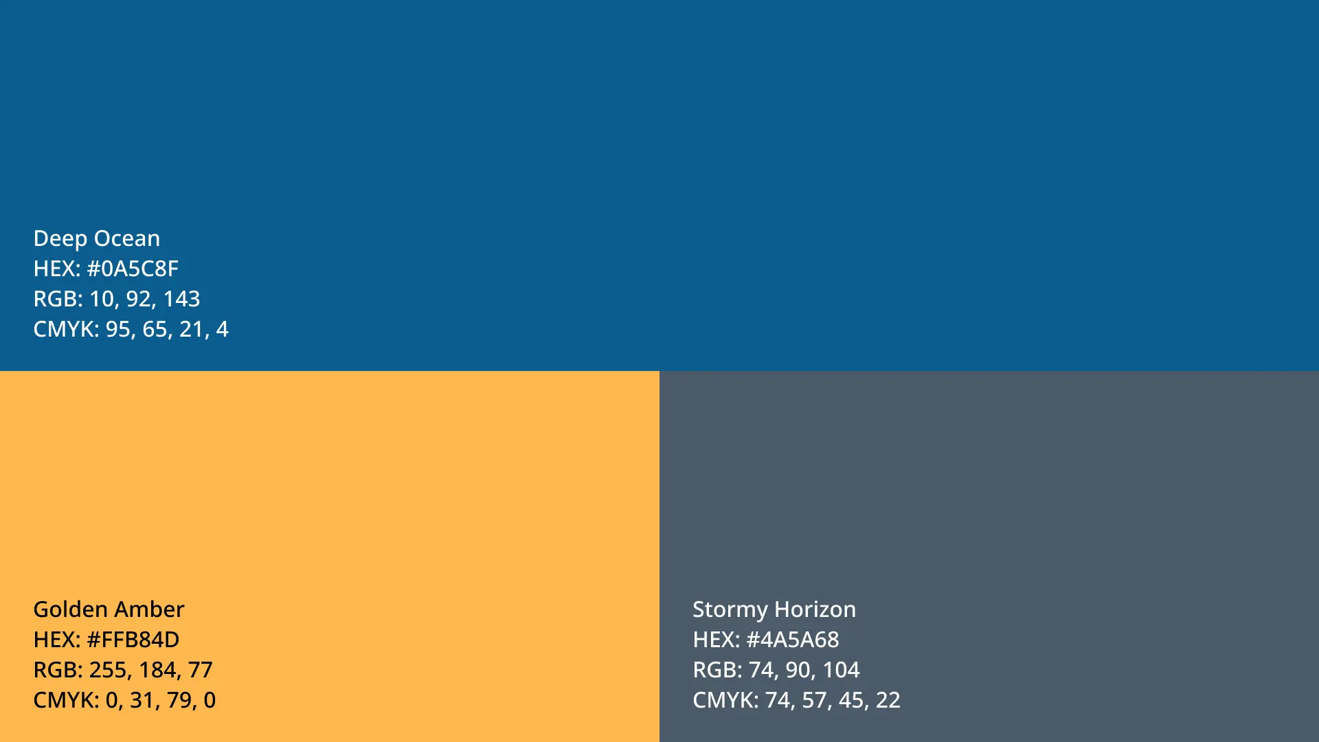
Brand colors: The bold and high-energy color palette reflects the brand’s dynamic nature. It conveys boldness, trustworthiness, reliability, and modernity… perfectly aligned with the brand’s promise of fast, secure, and seamless logistics solutions.
Brand fonts: A bold, strong, and modern sans-serif font was carefully selected for boldness, clarity, professionalism, reliability, and impact, ensuring cleanliness and legibility across all digital and physical touchpoints.
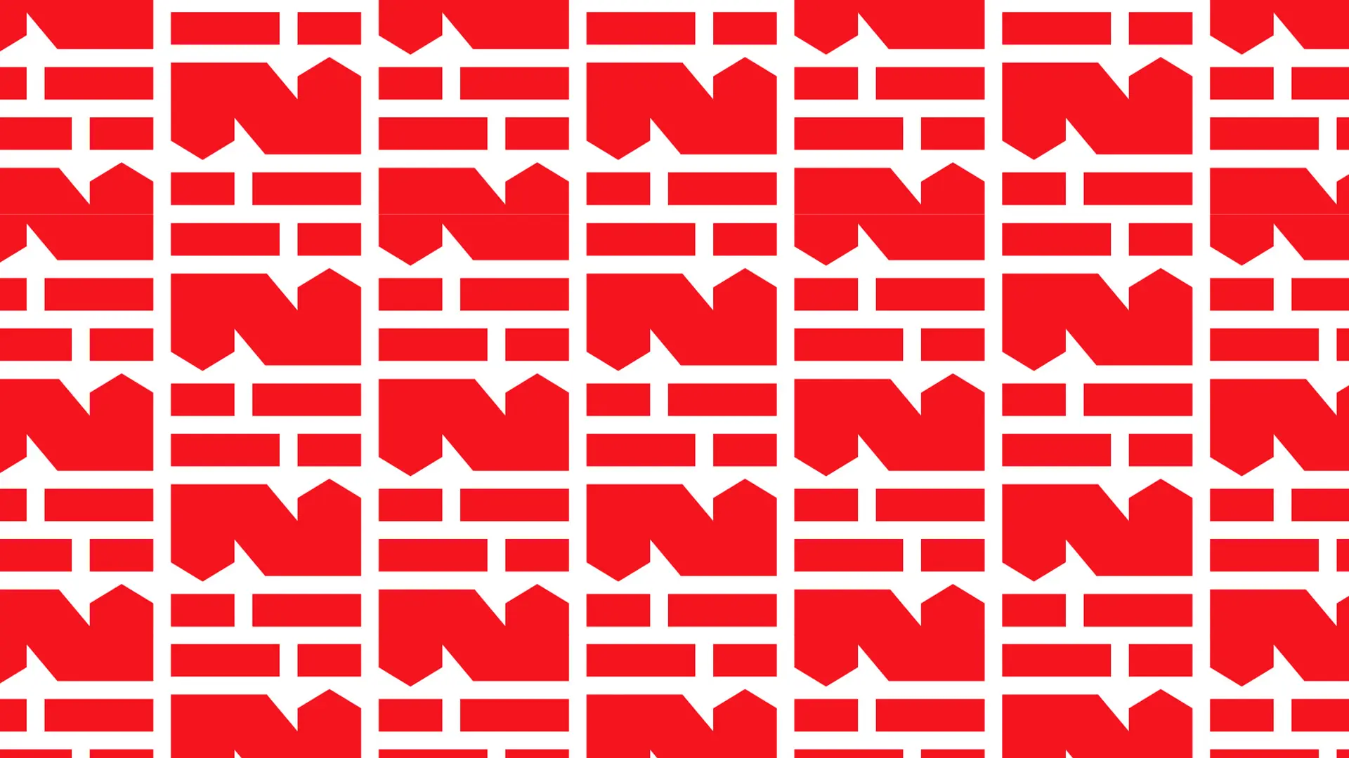
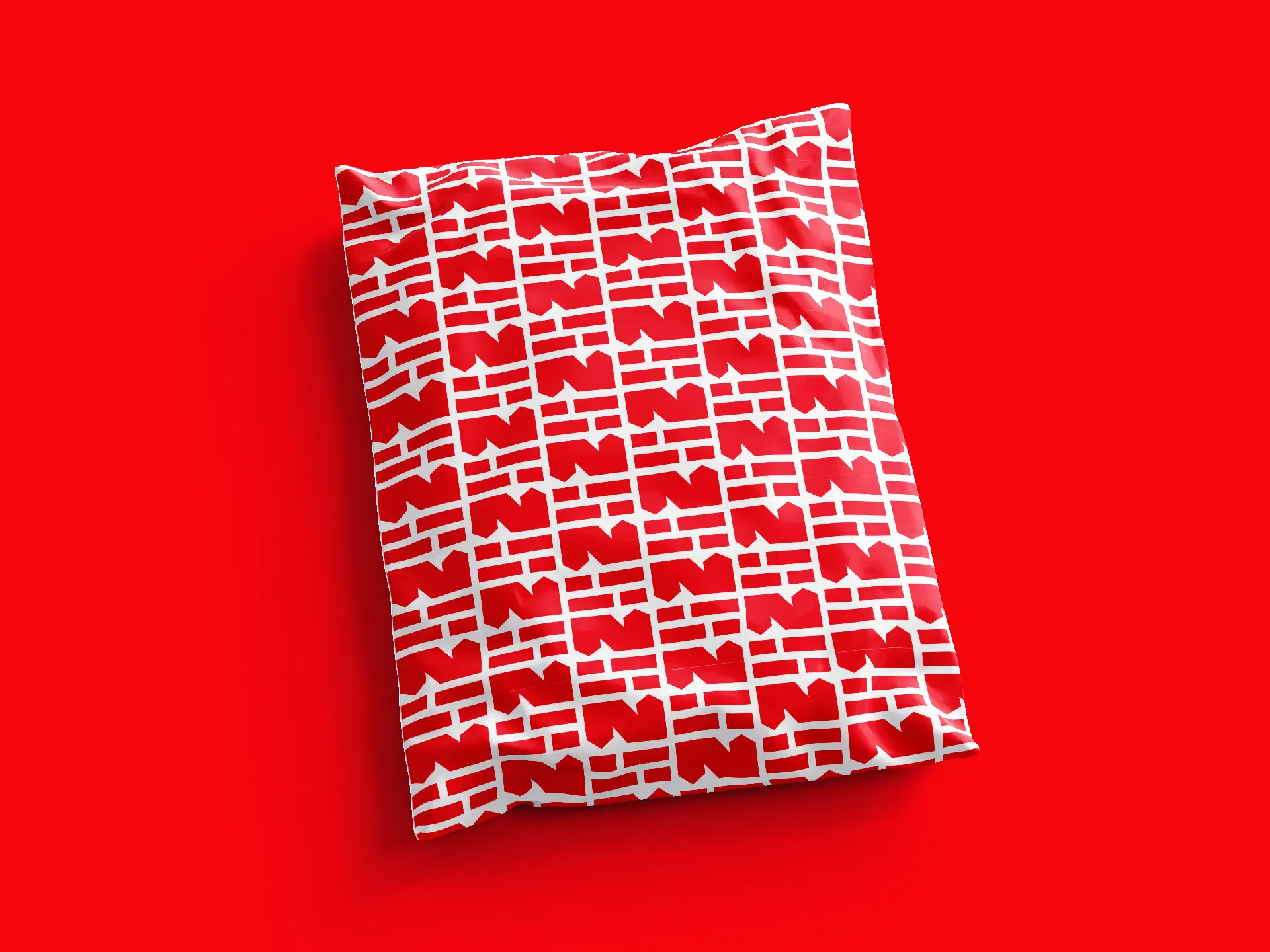
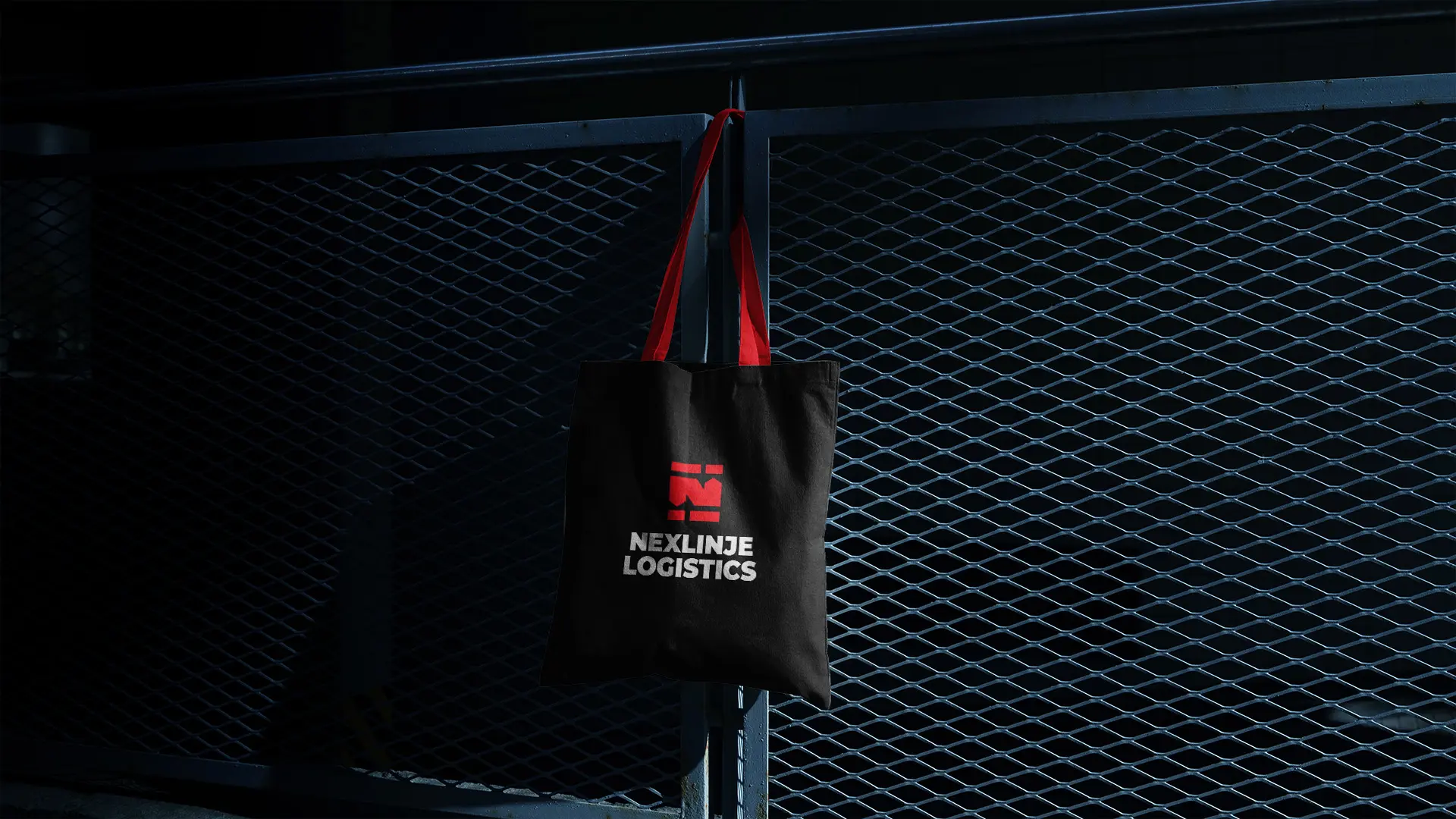
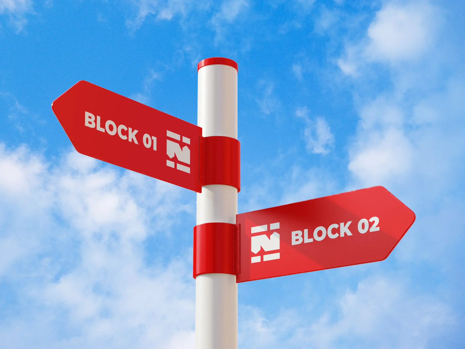
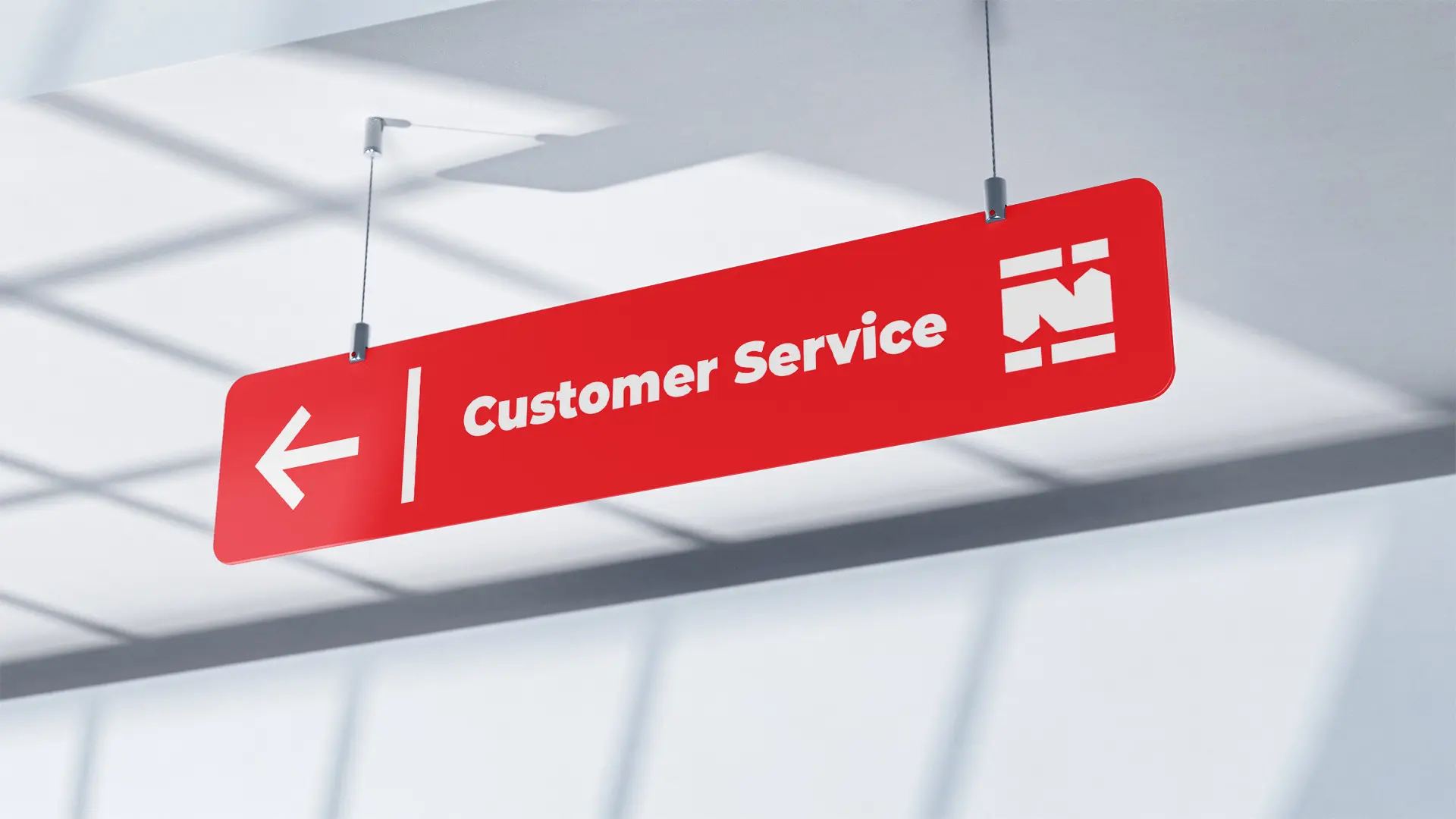
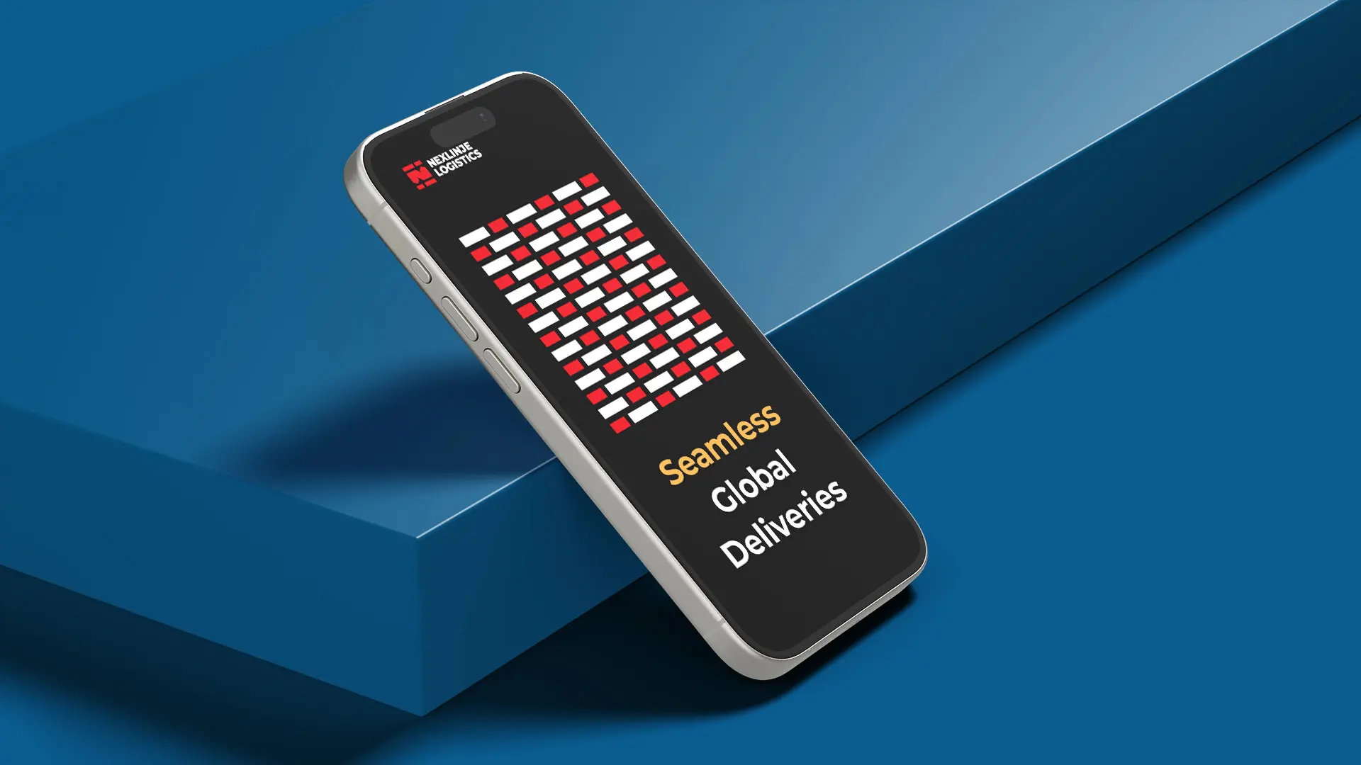
Brand elements: A dynamic, motion-inspired brand pattern and supporting graphic elements were created to bring the Nexlinje Logistics identity to life beyond the logo. Drawing from the visual language of speed, movement, and structured organization, the pattern captures the brand’s core energy in a way that is both bold and purposeful. Applied across packaging, wrapping paper, the website, posters, and billboards, these elements create a cohesive and high-impact brand presence… ensuring Nexlinje Logistics is instantly recognizable at every point of contact.
© 2026 Cinnteffective. All Rights Reserved.