MurailWen Pillars
MurailWen Pillars is a real estate development and construction company that specializes in building strong structural foundations and developing durable, high-value properties. The company is focused on building residential and commercial properties based on the principles of strength, durability, and long-term value.
Role
- Brand strategy
- Logo design & visual identity
- Brand collaterals
The Challenge
MurailWen Pillars needed a brand identity that would accurately reflect the calibre of their work and its dual role as a structural pillars construction and real estate development company.
The challenge was to create a visual brand identity that communicated:
– Structural strength and durability
– Professionalism and trust
– Long-term value and reliability
– A balance between construction expertise and property development
– A premium and credible market presence
The identity needed to stand apart from generic construction brands while remaining relevant to the industry. It had to resonate with property buyers, investors, partners, and stakeholders who value quality, stability, and confidence in every development.
The Solution
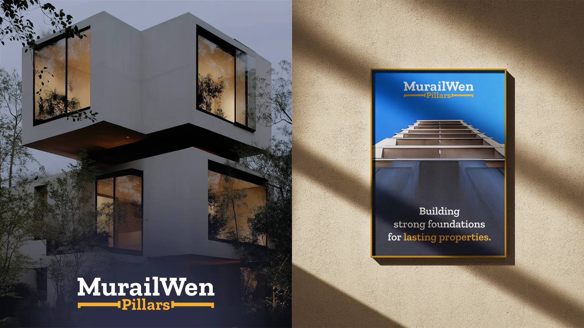
A strategic brand identity system was built around the concept of strength, structure, and foundation… the core ideas embodied by the name MurailWen Pillars. Every visual element was chosen and designed to reinforce the company’s positioning as a trusted builder and developer of lasting properties.
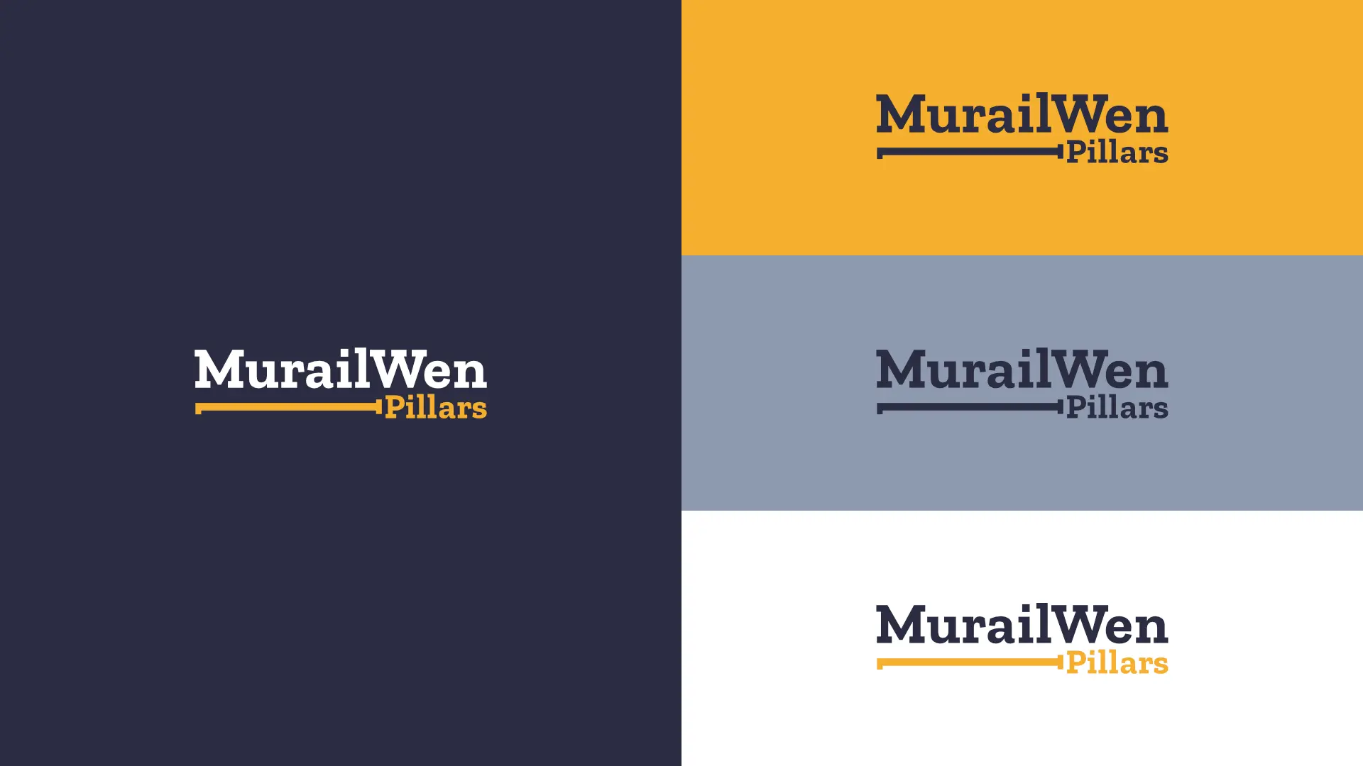
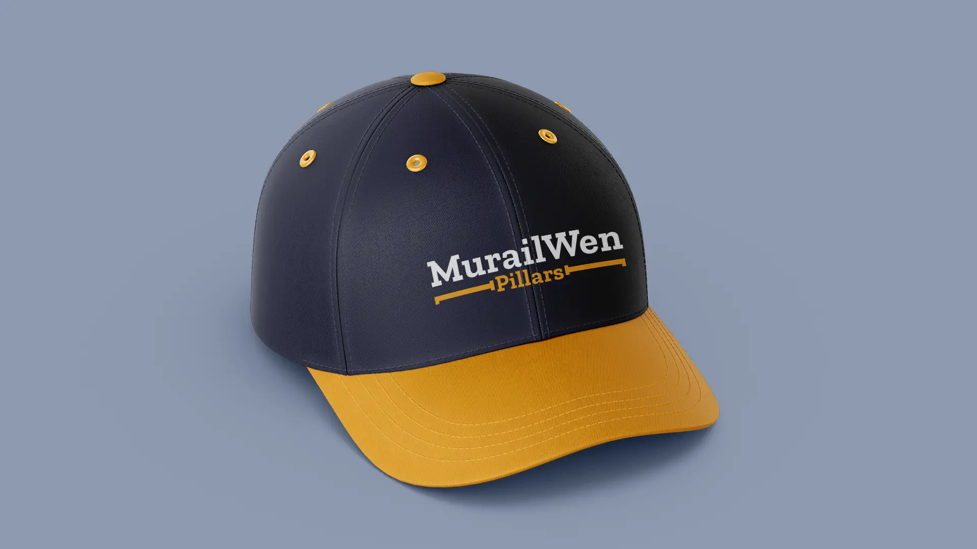
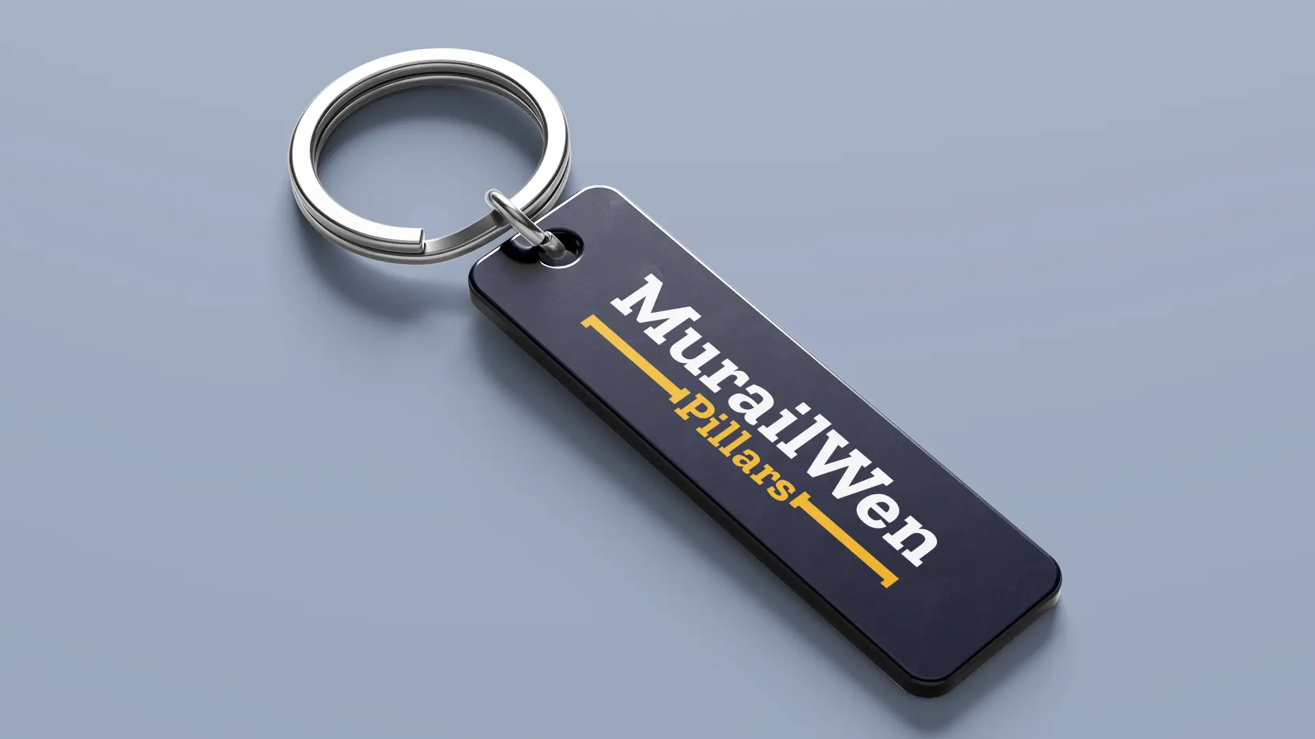
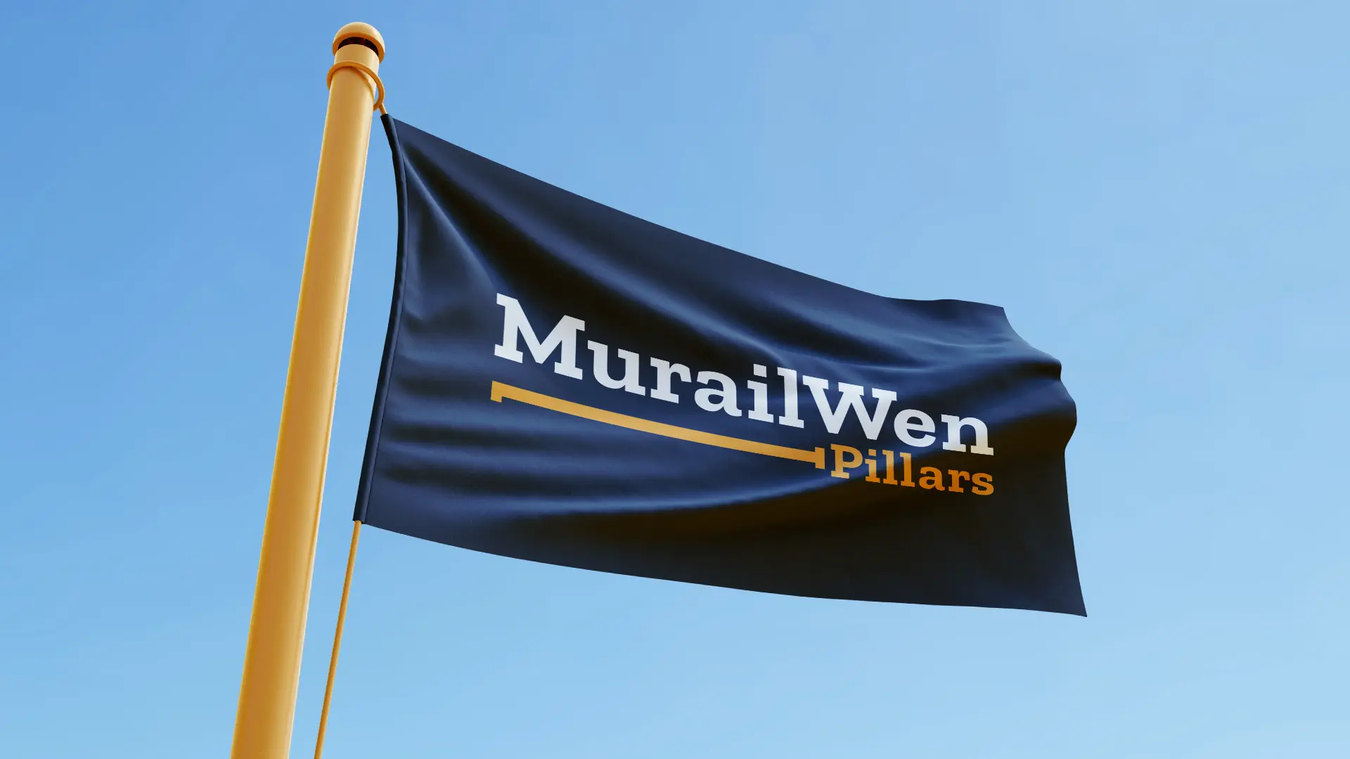
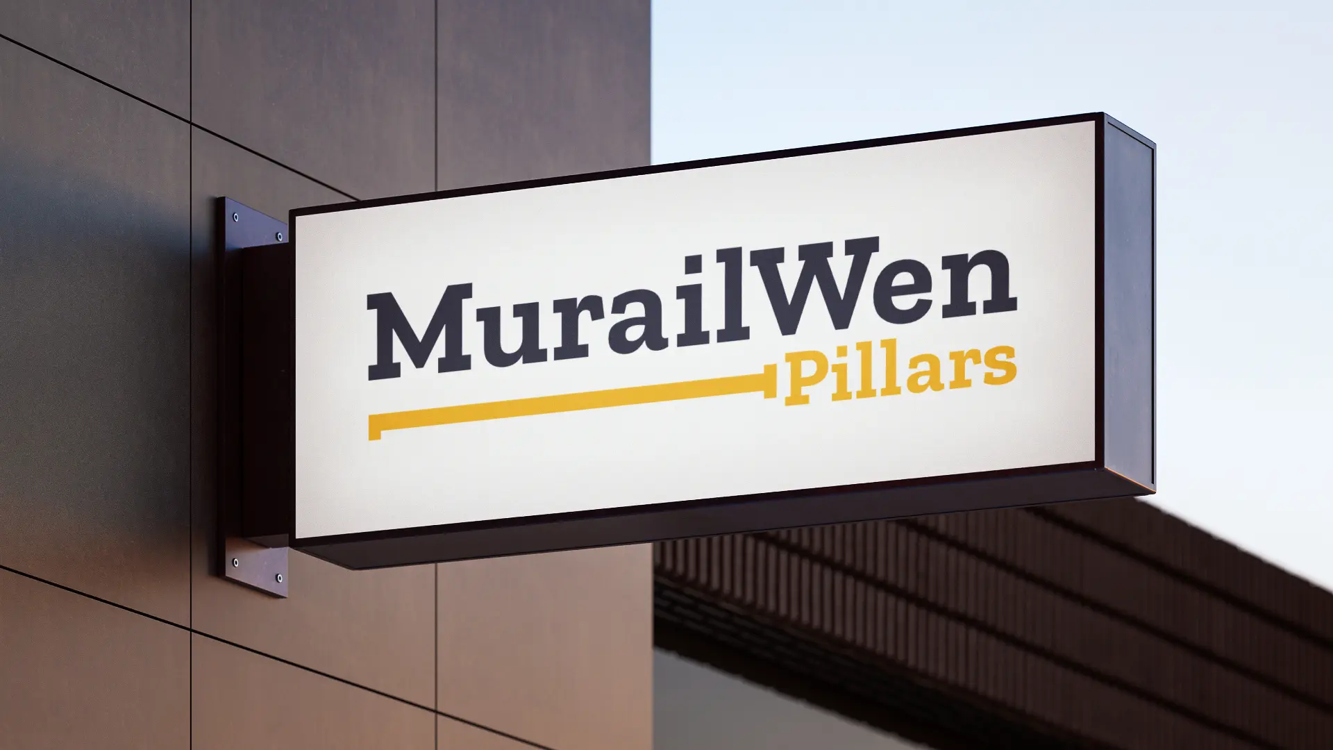
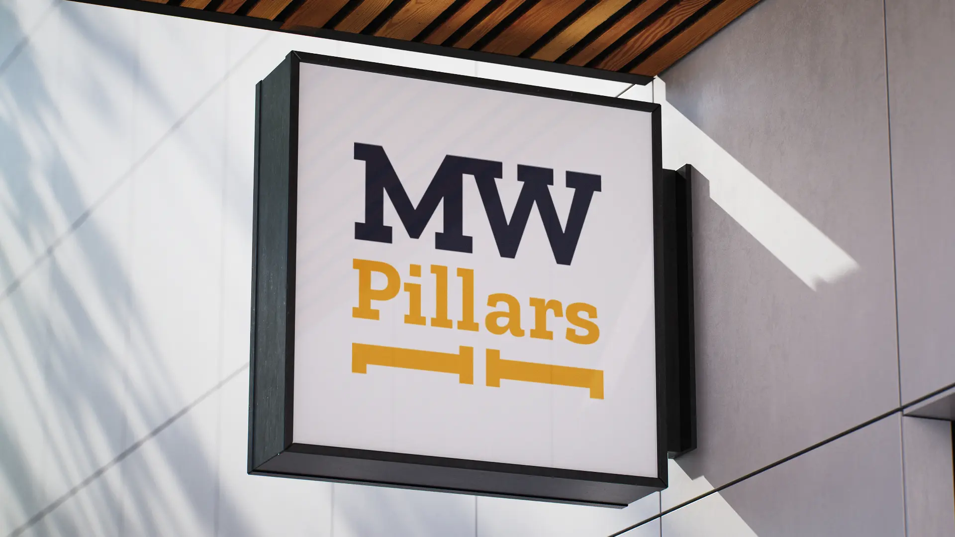
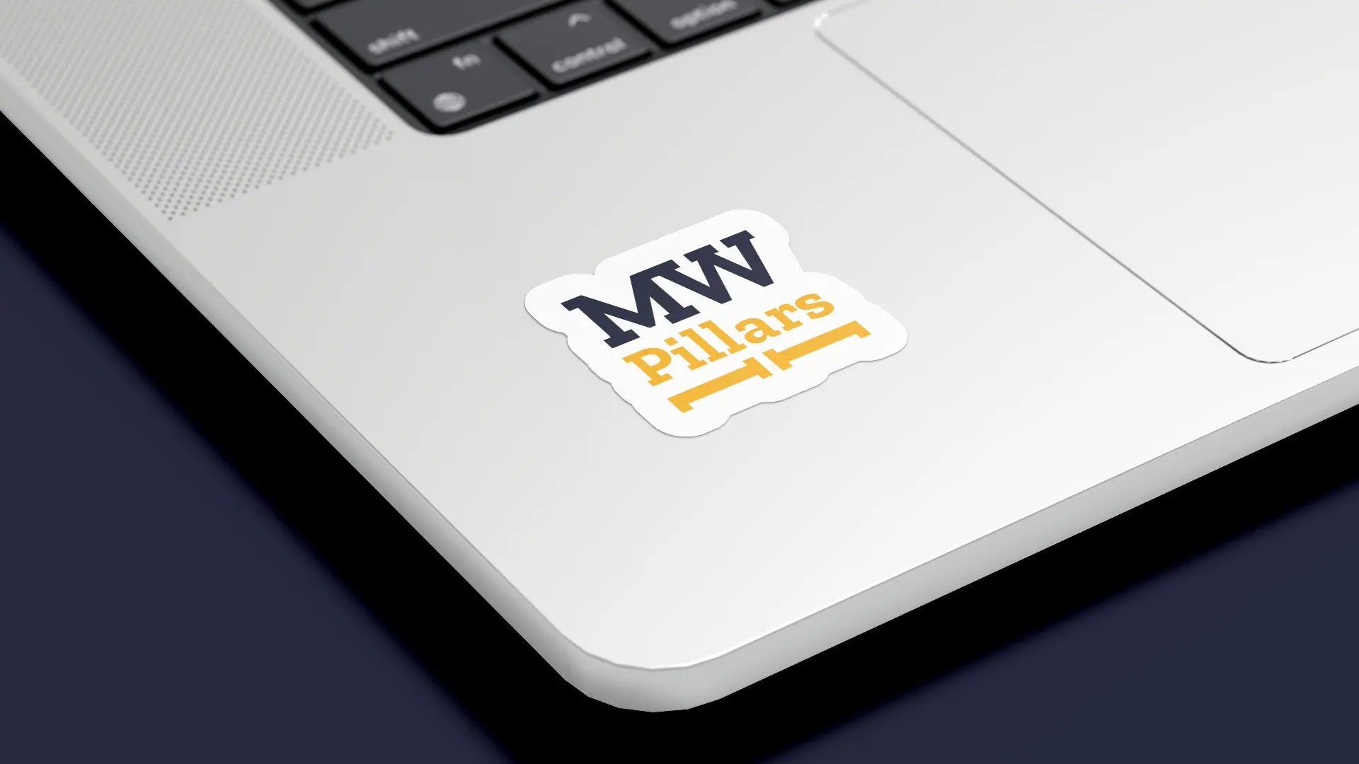
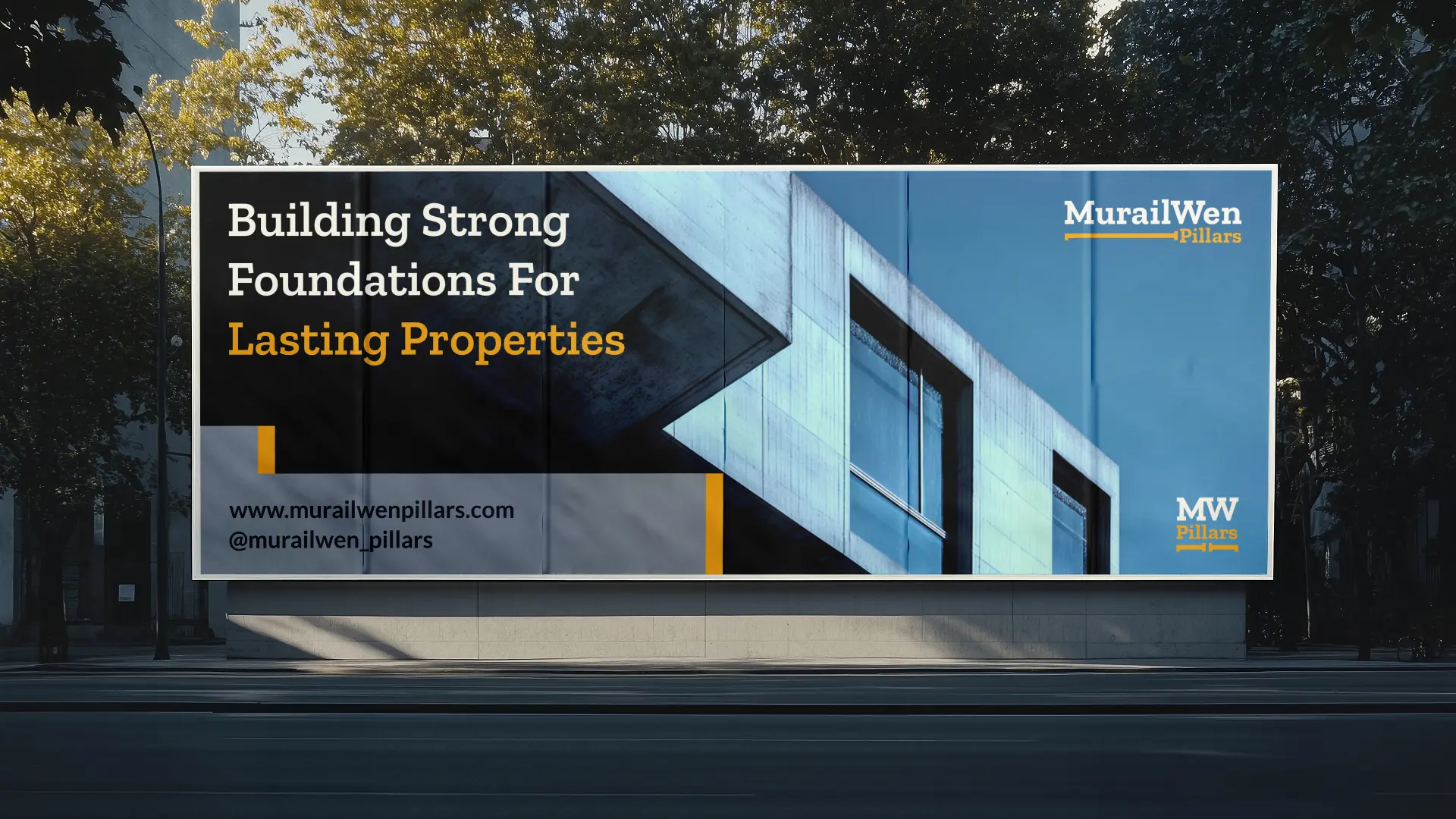
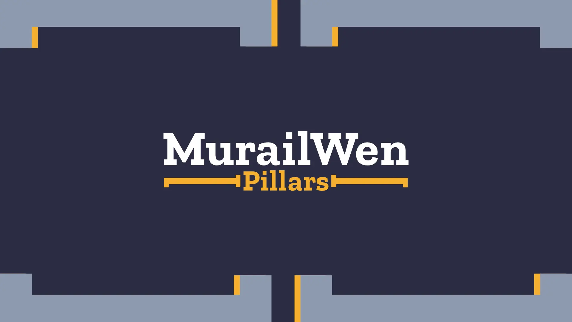
Logo design: The logo was designed to represent the company’s commitment to strong foundations and structural integrity. Inspired by architectural forms and reinforced support systems, the logo communicates stability, strength, construction expertise, precision and professionalism.
Its geometric structure creates a sense of solidity and reliability while maintaining a clean and modern appearance suitable for both construction and real estate development. The result is a mark that feels established, dependable, and built to endure… just like the projects MurailWen Pillars delivers.
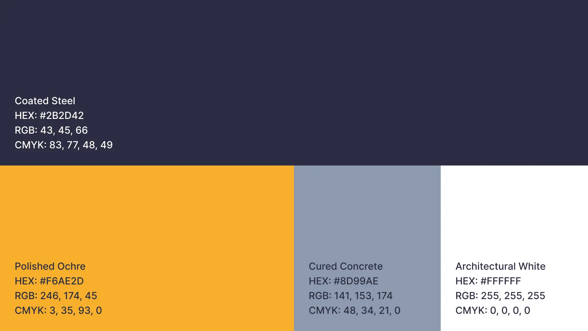
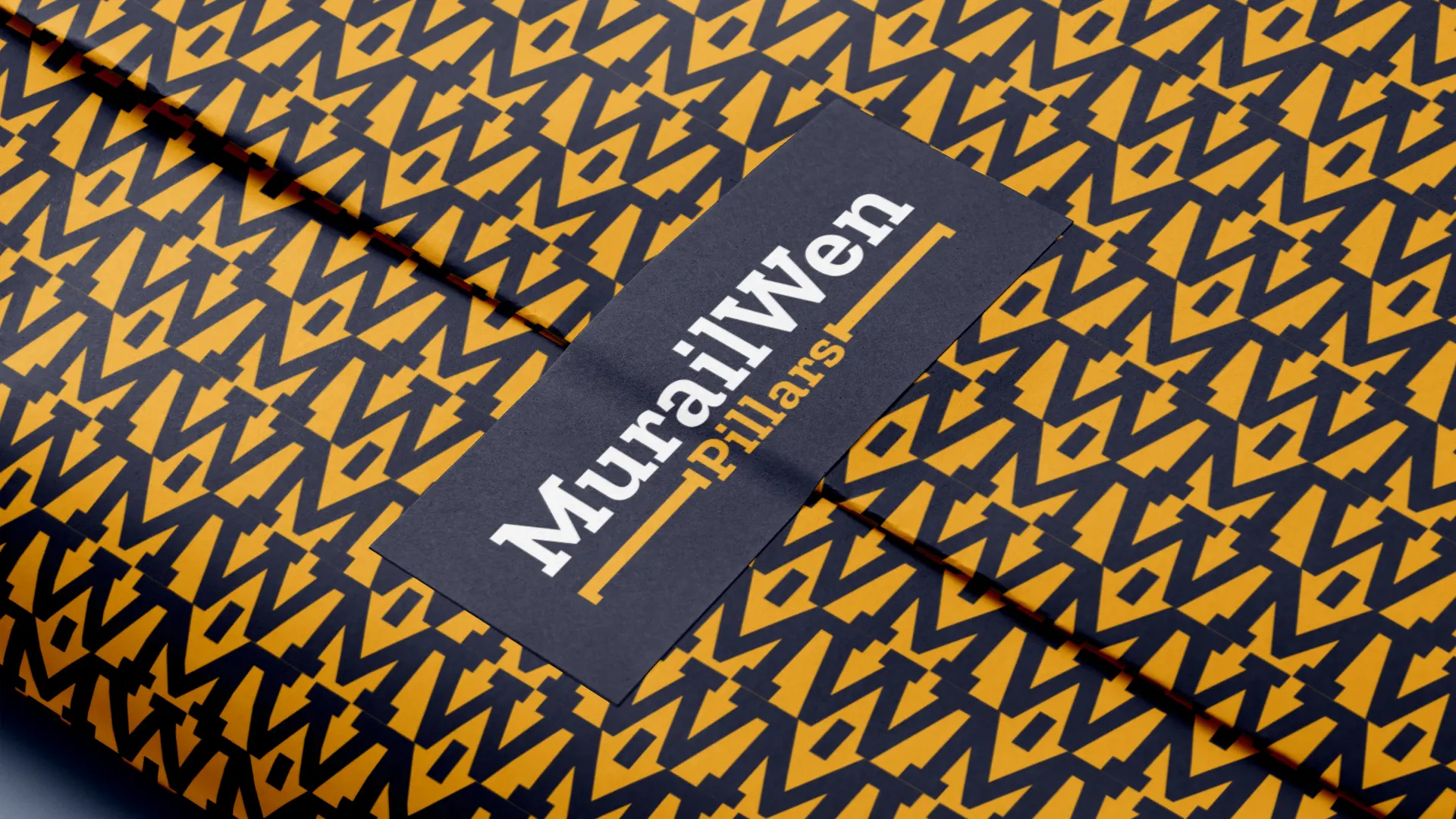
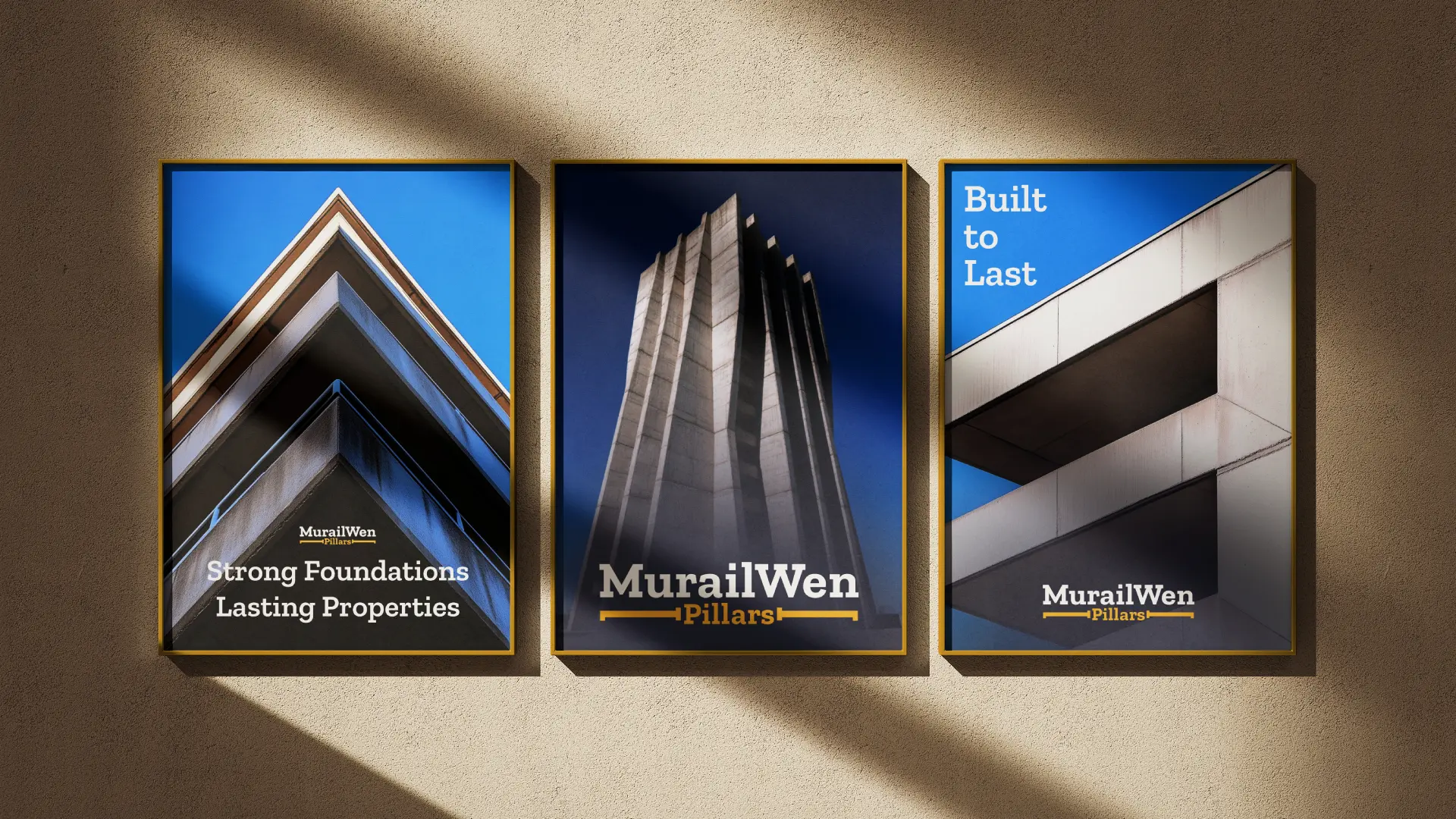
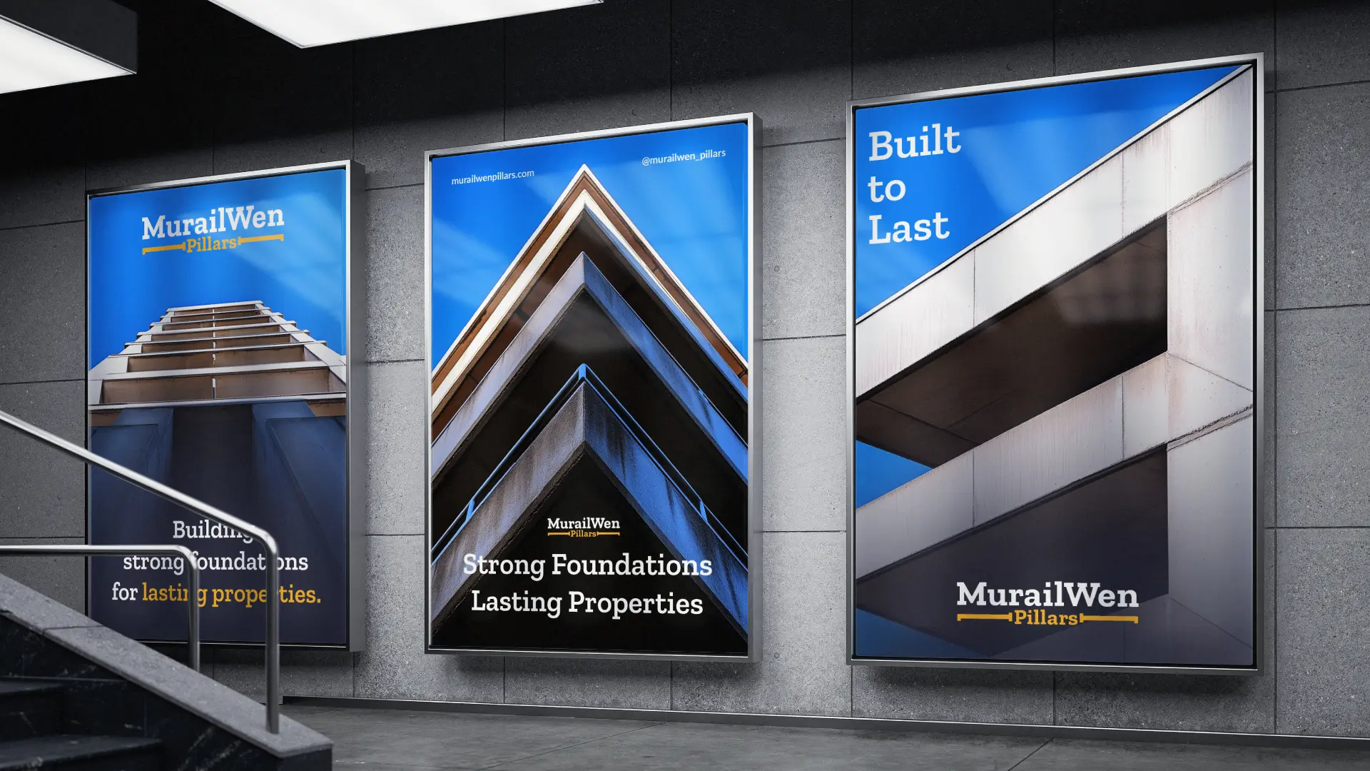
Brand colors: The color palette introduces 4 intentional colors and was inspired by construction materials… strategically selected to balance strength and authority.
#2B2D42 (coated steel): The primary brand color represents strength, trust, stability, and professionalism. It’s deep architectural tone evokes steel, engineering structures and solid foundations.
#F6AE2D (polished ochre): Used as the accent color, this vibrant tone symbolizes confidence and commands attention.
#8D99AE (cured concrete): Inspired by concrete, steel, and modern building materials, this supporting color adds balance, sophistication, and technical precision.
#FFFFFF (architectural white): This neutral tone provides clarity, contrast, and flexibility across all brand applications.
Brand fonts: A modern, structured slab serif , paired with a sans serif font was selected to reflect reliability, precision, and professional execution.
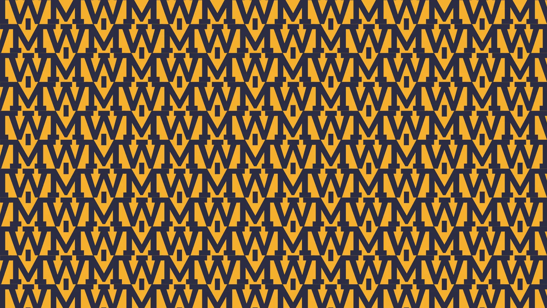
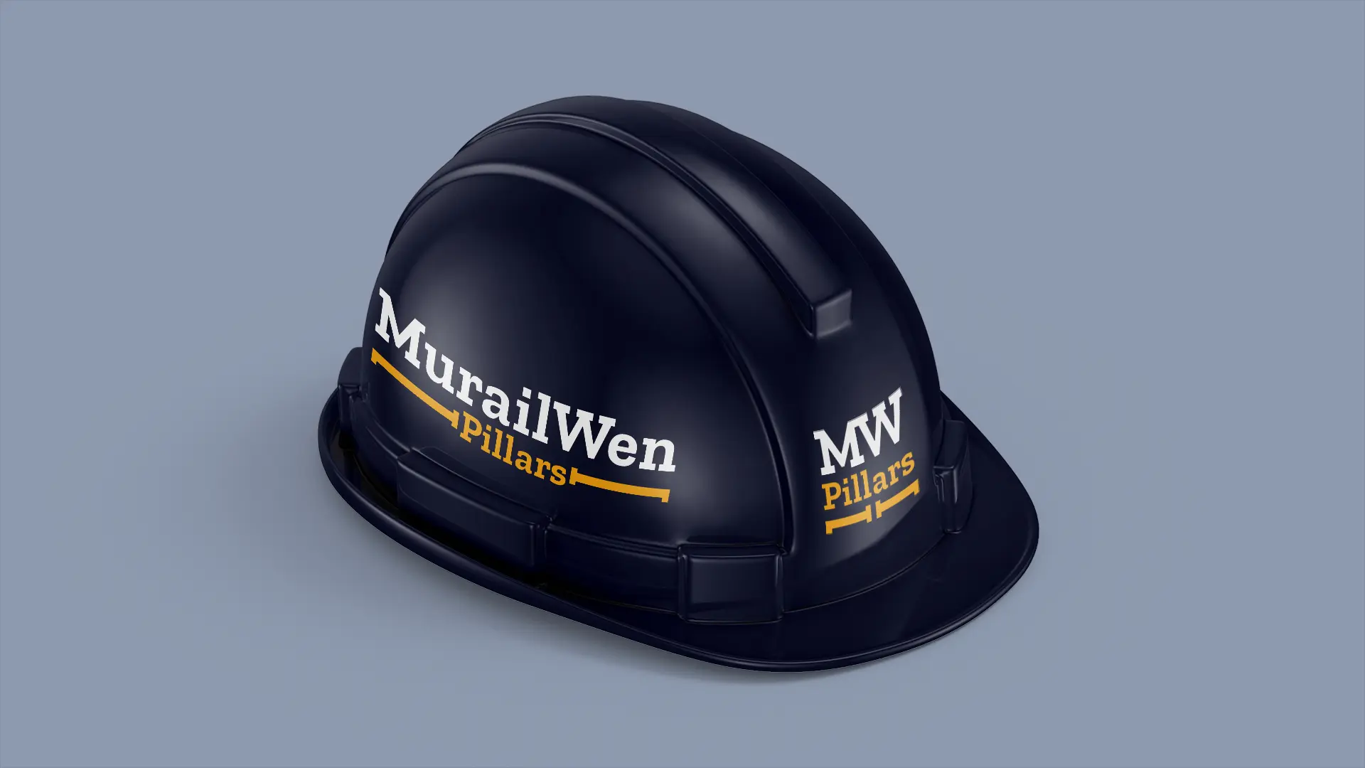
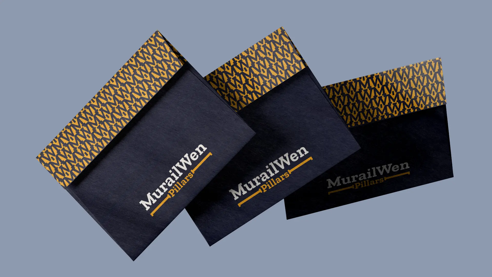
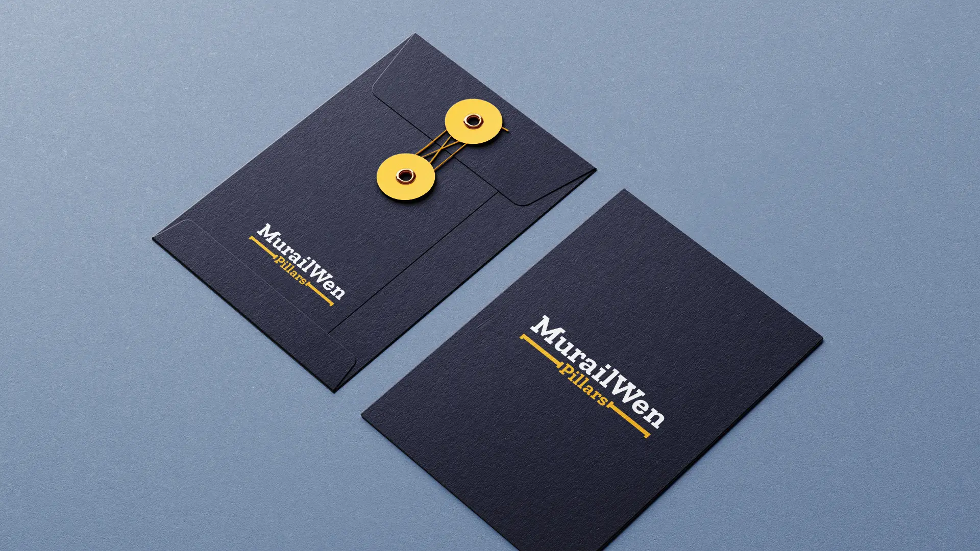
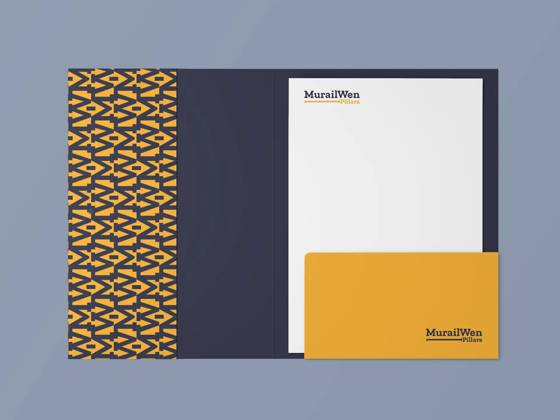
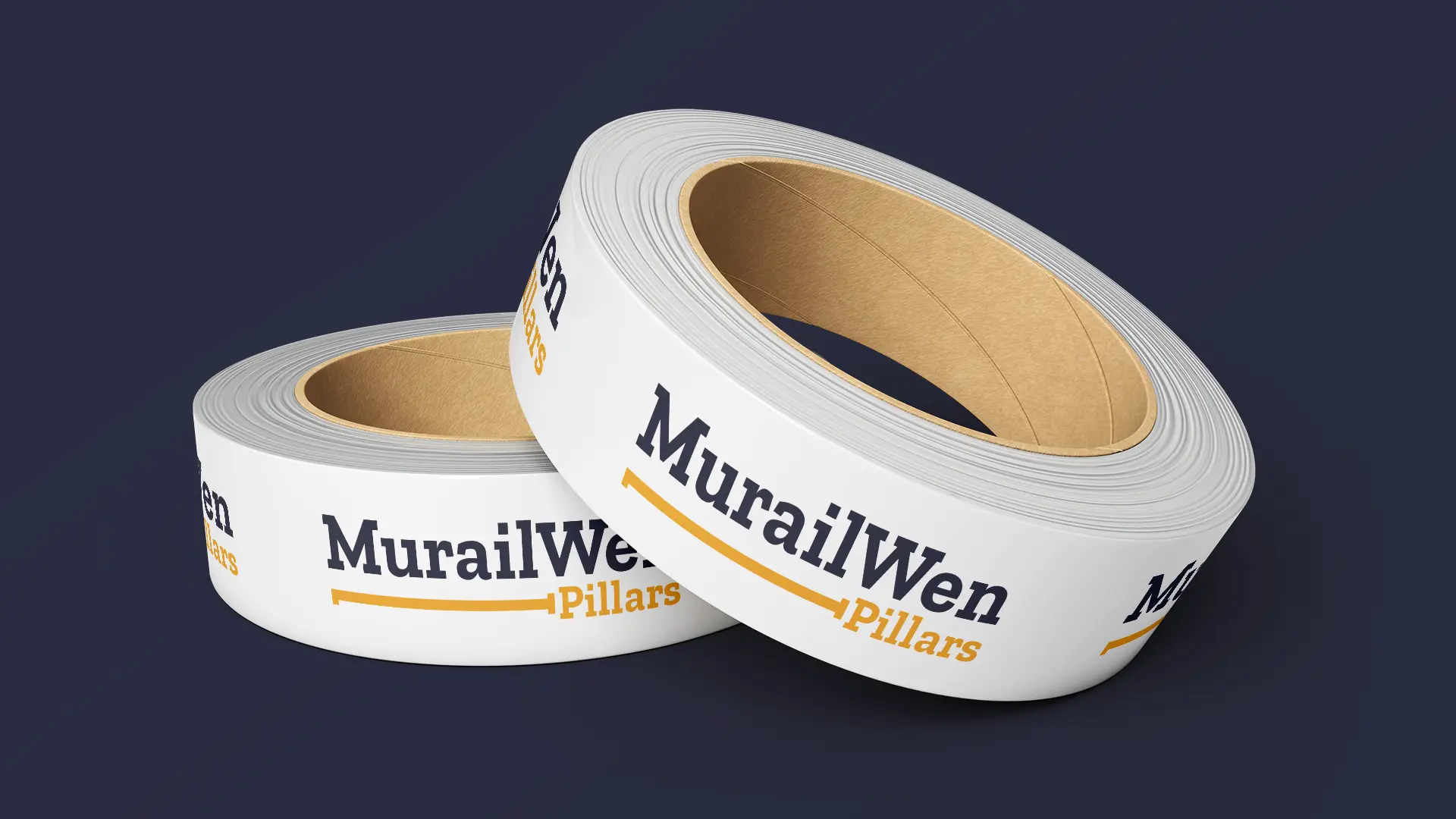
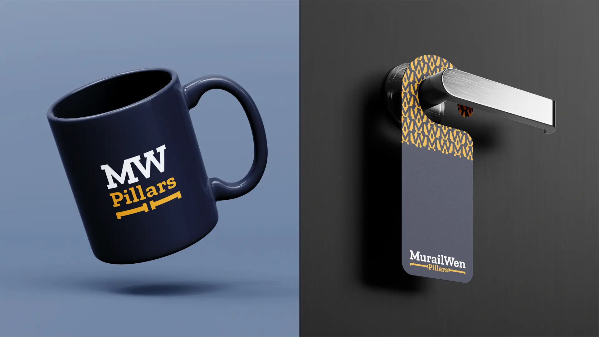
Brand elements: Supporting brand elements were created to reinforce the identity beyond the logo. These elements draw inspiration from architectural frameworks, pillars and support systems, building layouts, and construction geometry. The graphic system introduces visual consistency across applications while strengthening the connection to the construction and development industry. Whether applied to project billboards, site hoardings, property brochures, envelopes, safety gear, or digital platforms, these elements help create a cohesive and recognizable brand identity and experience.
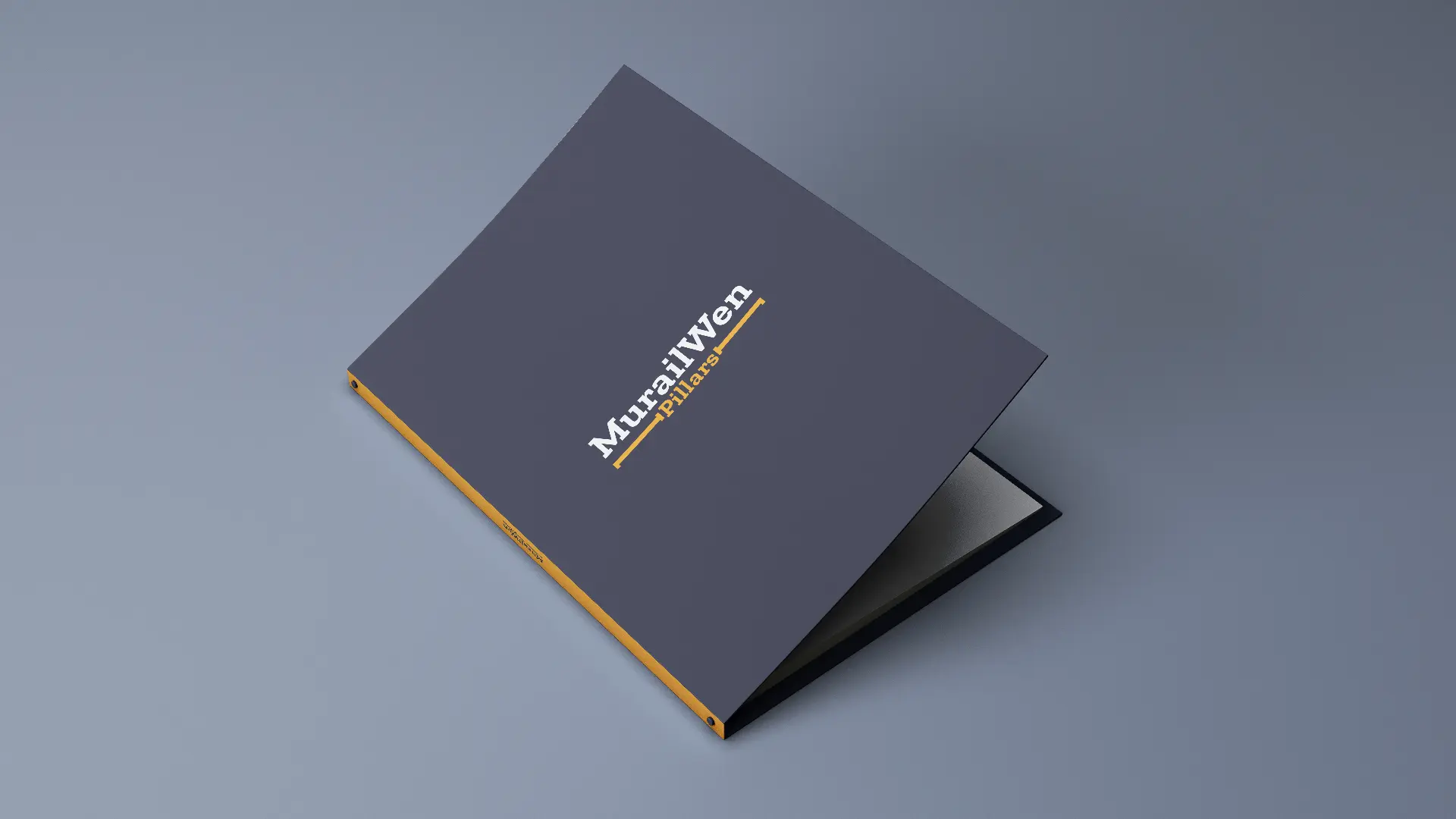
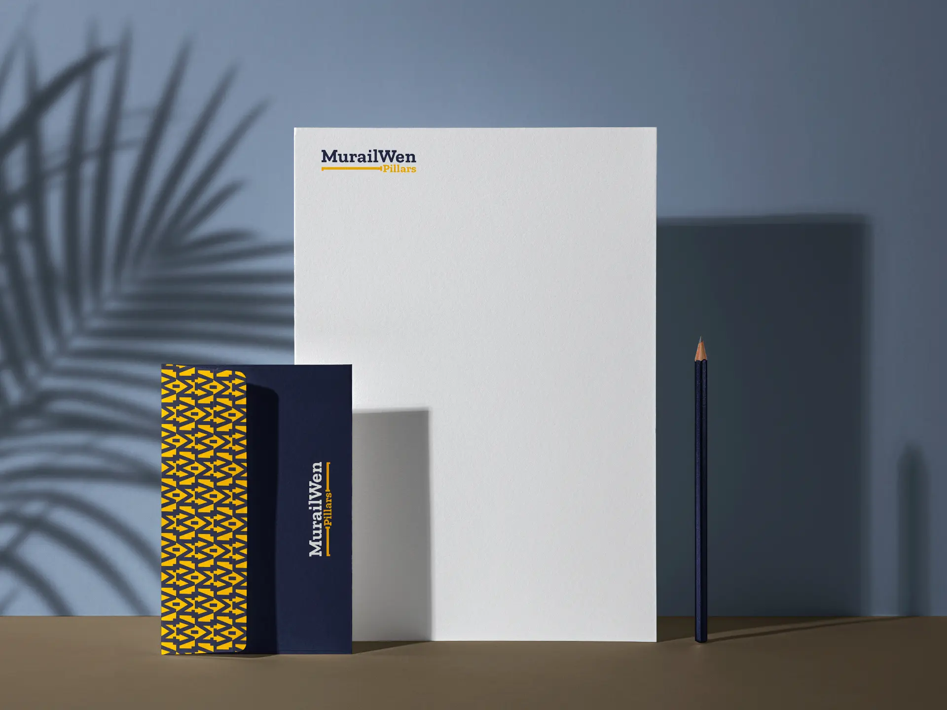
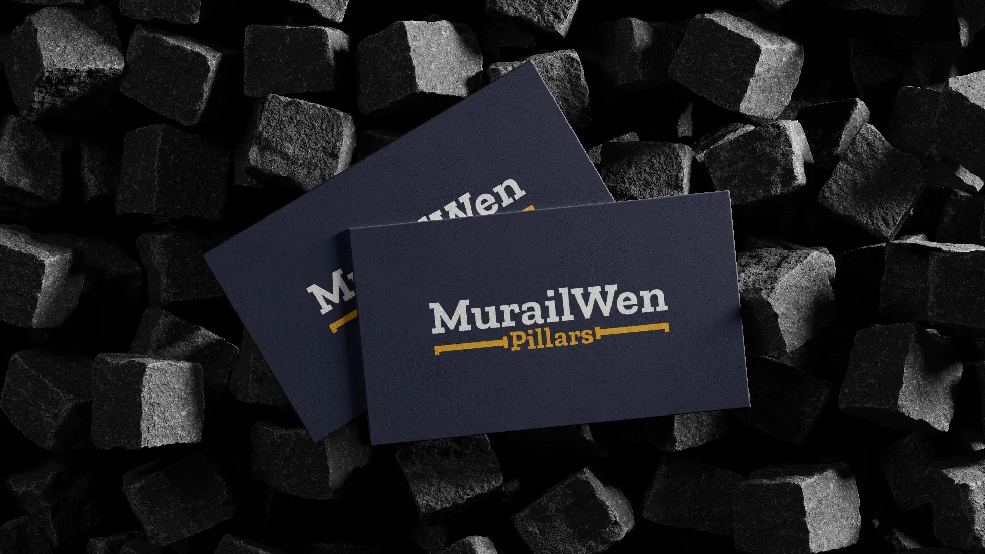
Brand collaterals: A cohesive stationery system was created to extend the brand identity into everyday business communications. The stationery applications ensure a consistent brand experience across both internal and external touchpoints. The use of the brand colors, fonts, pattern, and graphic elements across these materials reinforces the company’s identity while enhancing credibility and professionalism.
© 2026 Cinnteffective. All Rights Reserved.