Dooric Abodes
Dooric Abodes is a forward-thinking real estate company on a mission to redefine the property experience. More than just a real estate company, Dooric Abodes is a promise… a promise of trust, innovation, and excellence. From finding the right home to elevating everyday living, the company is committed to delivering exceptional properties that inspire confidence and transform lifestyles.
Role
- Brand strategy
- Logo design & visual identity
- Brand collaterals
The Challenge
Dooric Abodes needed a brand identity strong enough to establish credibility and make a lasting impression in a highly competitive industry. The identity needed to do the heavy lifting early… building trust, signaling quality, and making Dooric Abodes impossible to overlook.
The Solution
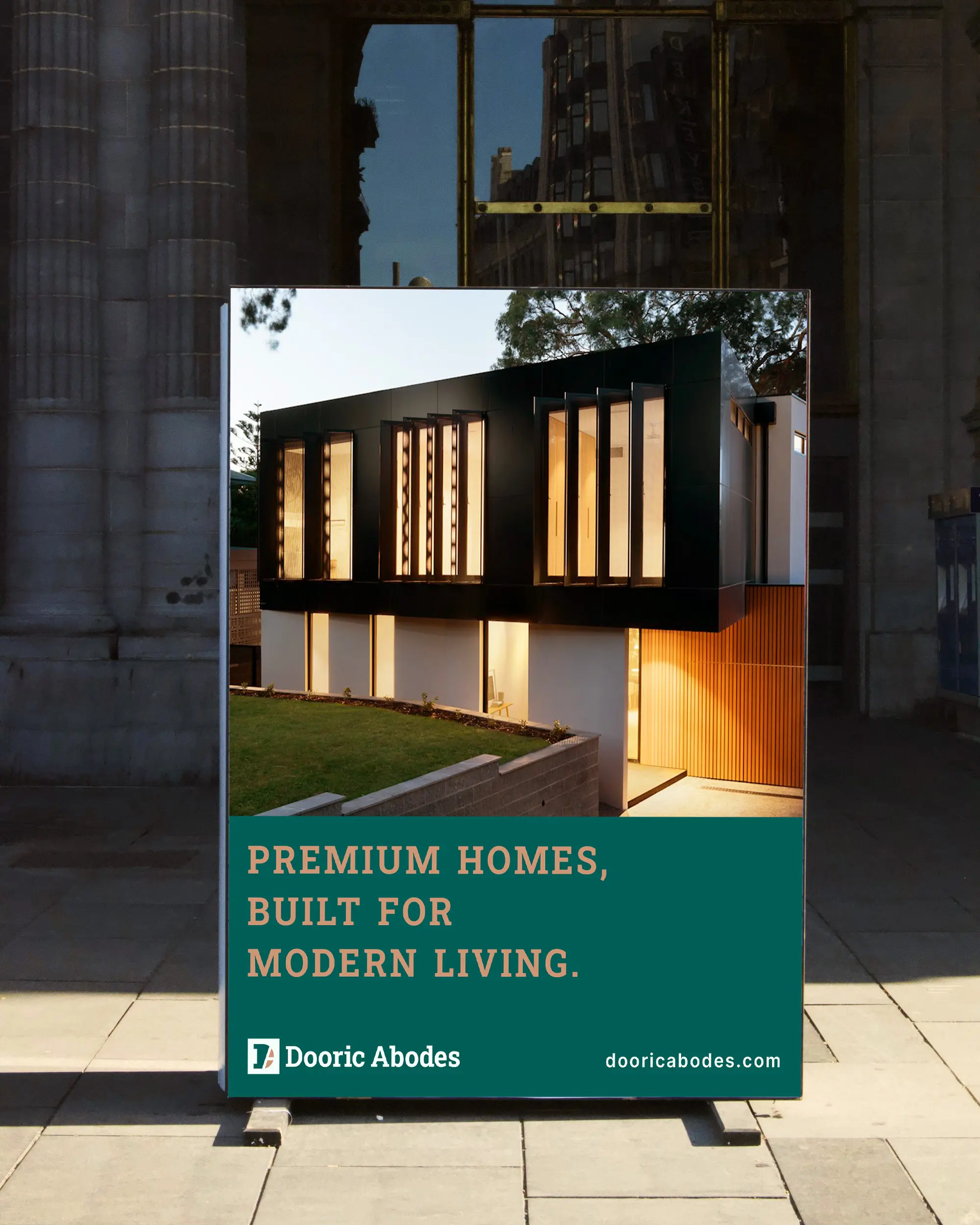
A bold and cohesive brand identity system was built around the core values of trust, boldness, precision, and premium quality… everything Dooric Abodes stands for. Every visual decision was made to position the company as a standout player in the real estate market.
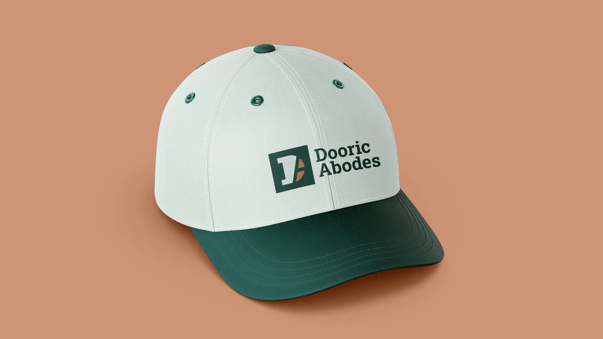
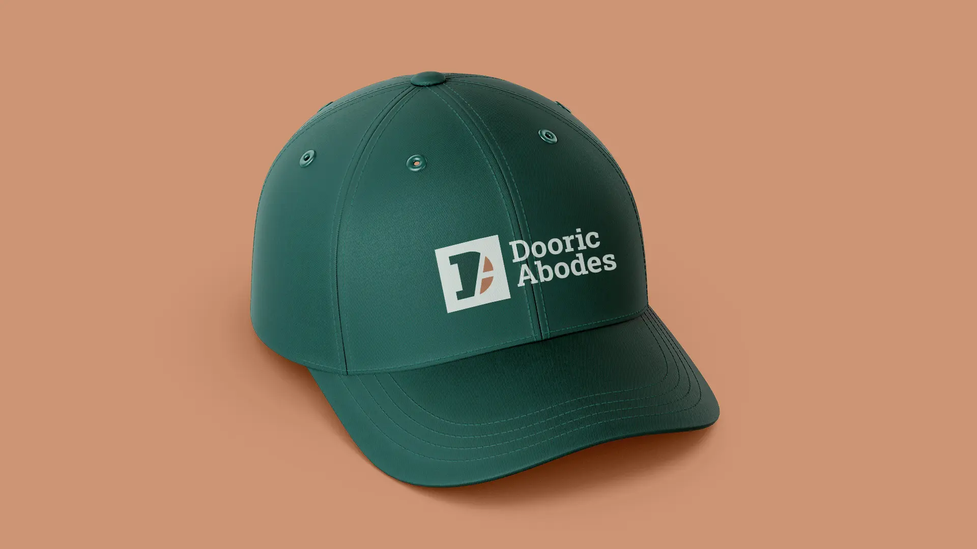
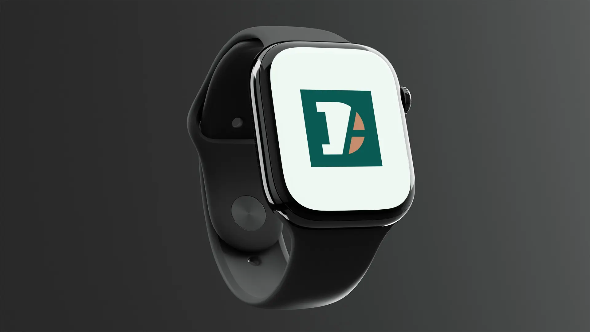
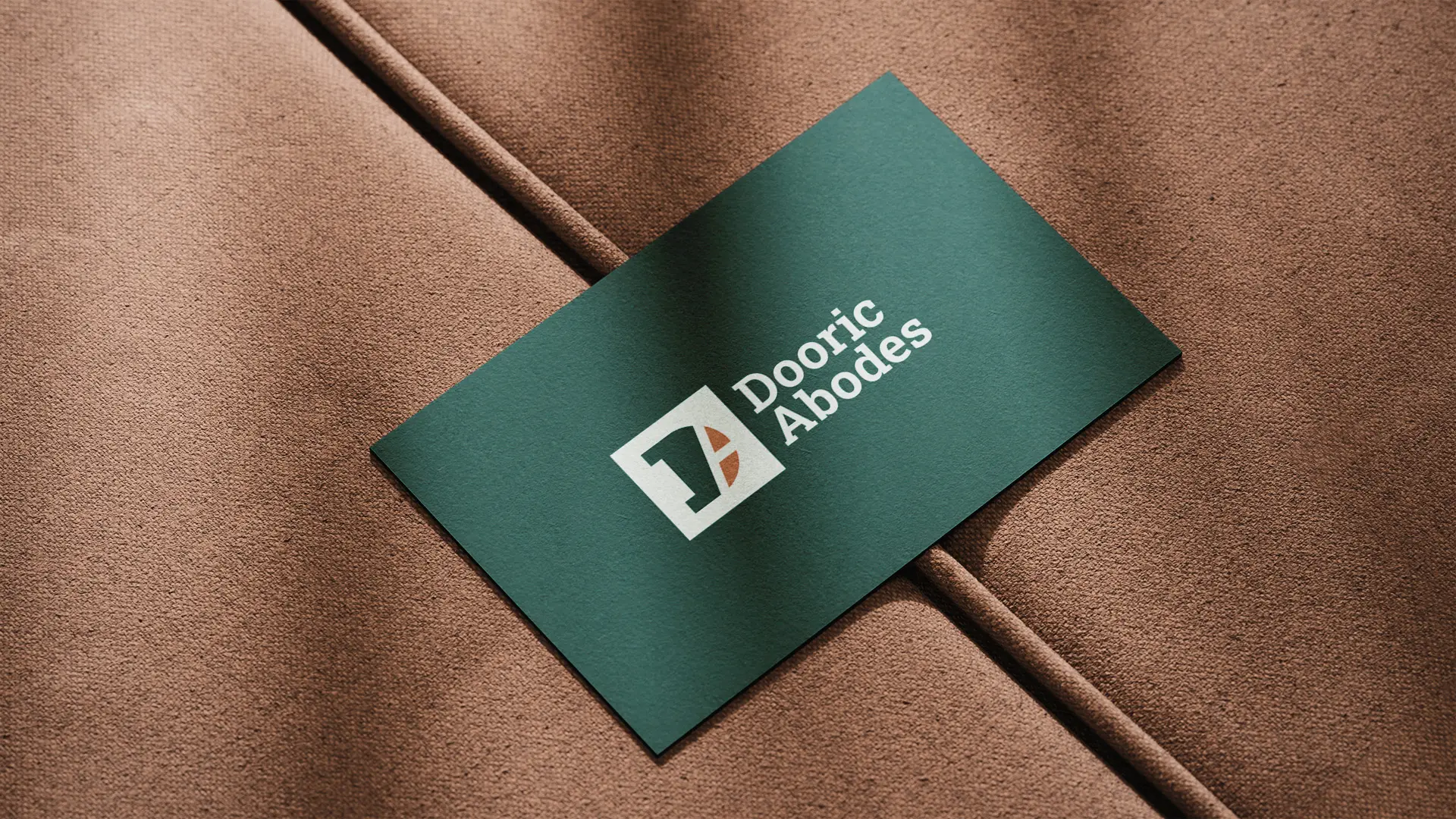
Logo design: The primary Dooric Abodes logo is a combination mark strategically designed to be bold, premium and instantly recognizable. The concept of the brand mark conveys what the brand does, which is developing premium homes. The brand mark depicts a top-down view of a premium home.
The square shape represents land… the very foundation of every property Dooric Abodes develops. Inside the square sits a D-like form… the first letter of Dooric, shaped to depict a premium home viewed from above, communicating exactly what the brand does.
The thick lines cutout is a negative space of the letter “A” of Abodes. This negative space represents roads and pathways.
The result is a mark that is bold, layered, and built with precision… a logo as thoughtfully constructed as the properties it represents.
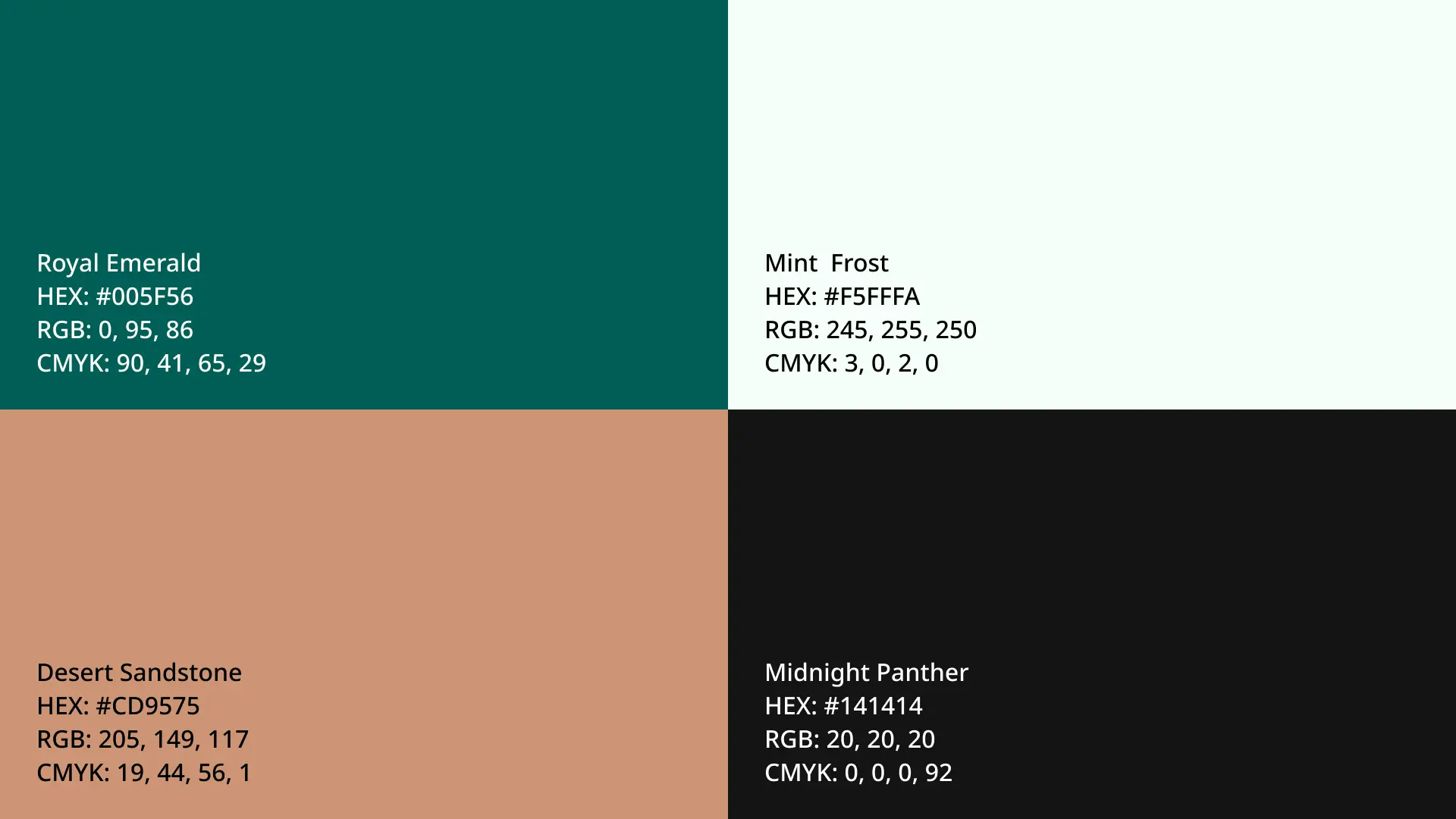
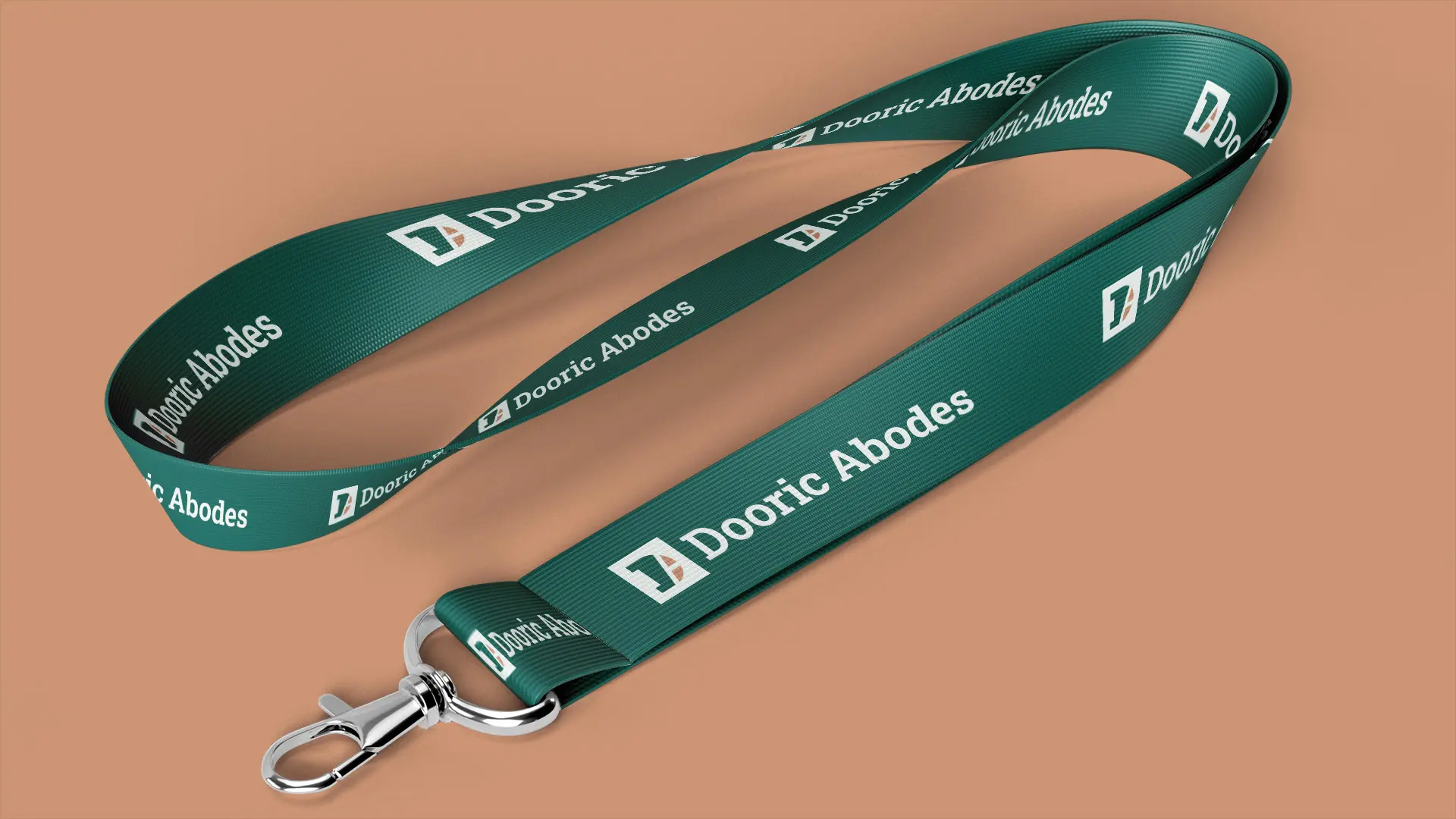
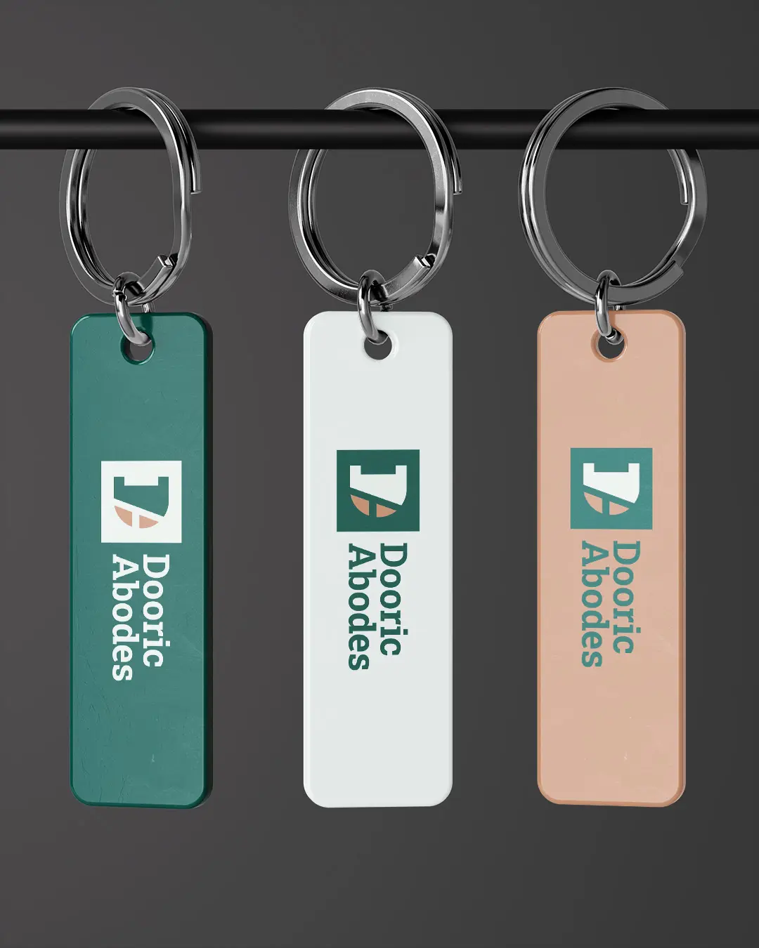
Brand colors: The brand color palette was strategically selected to evoke trust, boldness, premiumness, and modernity.
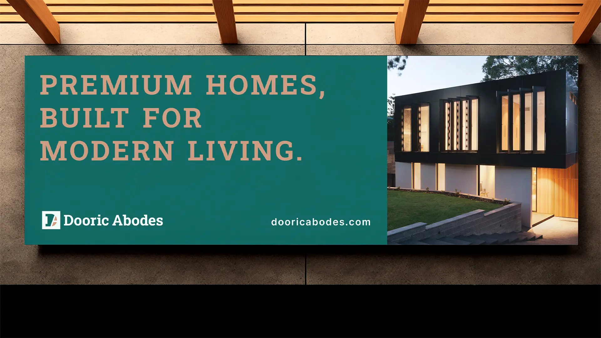
Brand fonts: A combination of a bold and timeless serif font for headlines and a clean and modern sans-serif font for body text. This font pairing ensures the brand communicates professionalism, boldness, trustworthiness, premiumness and modernity.
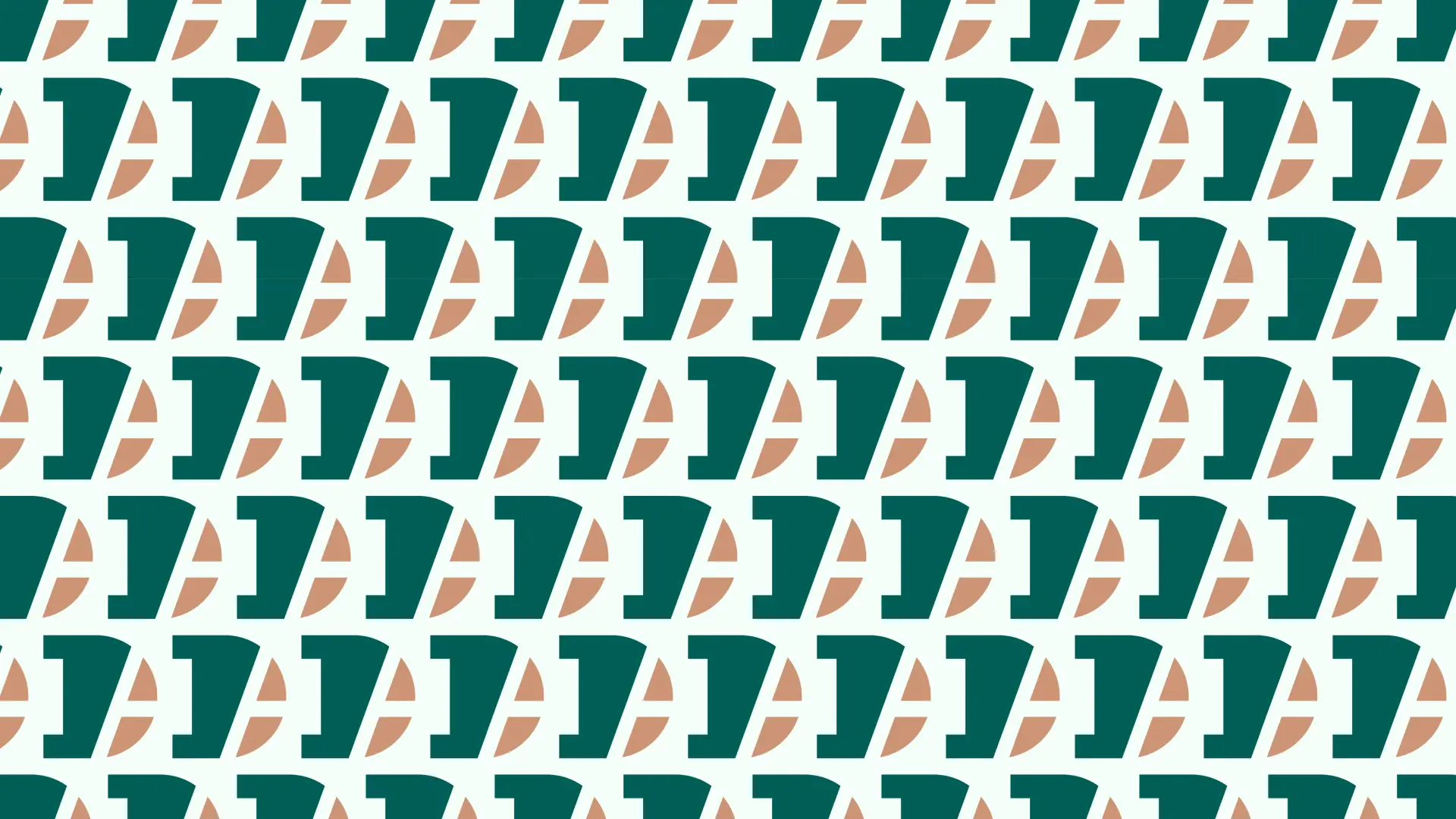
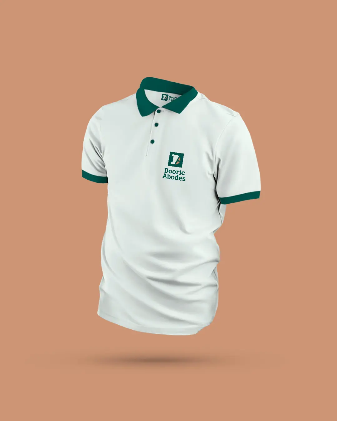
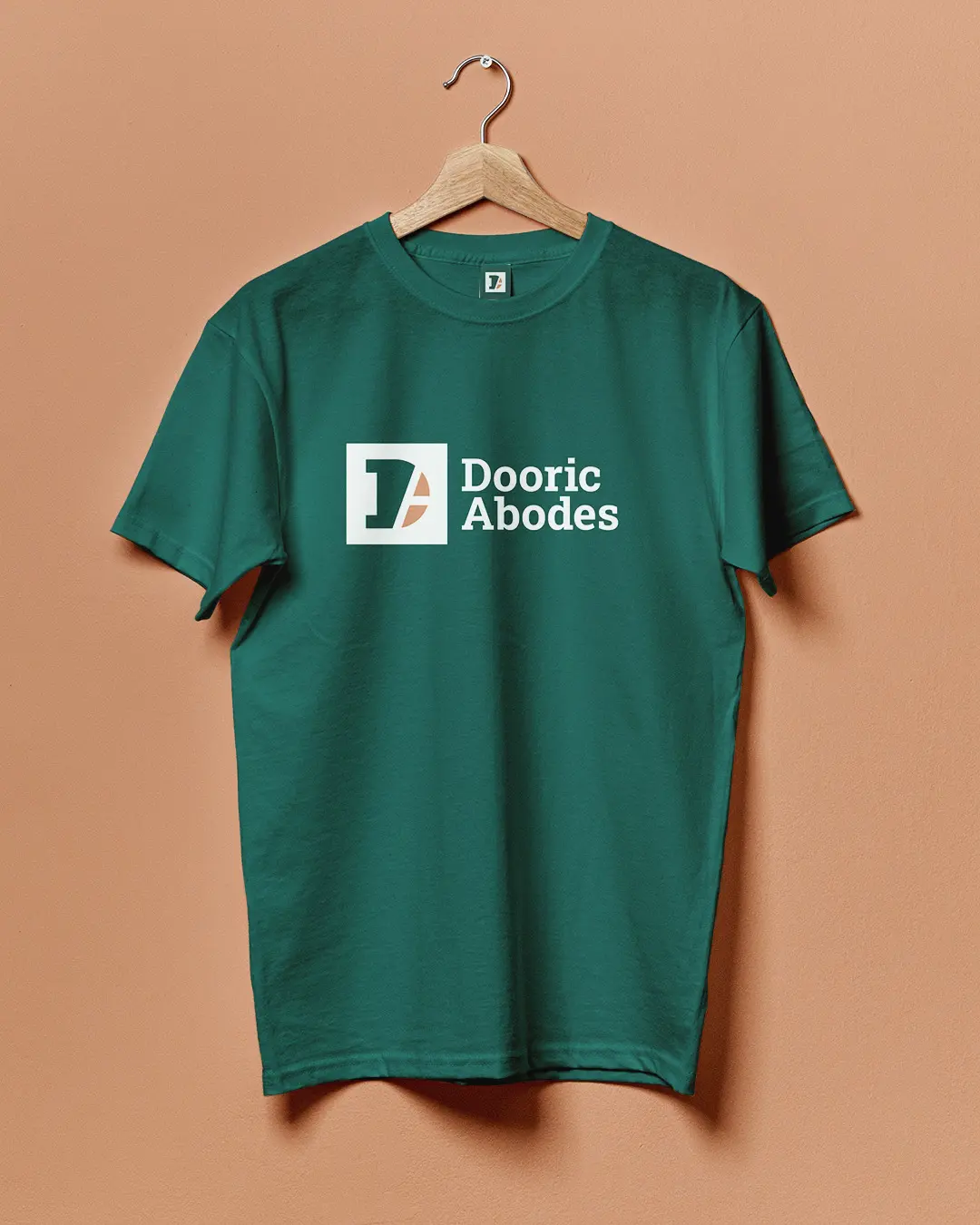
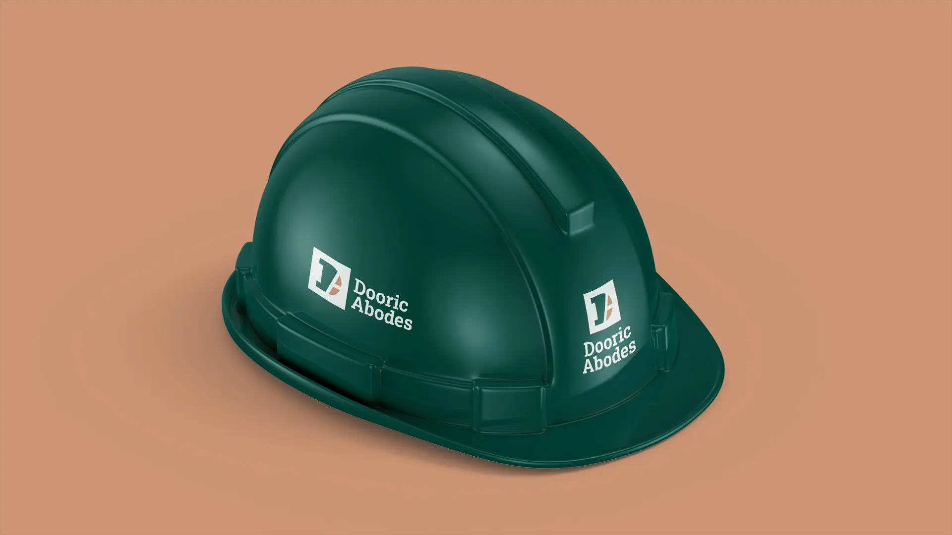
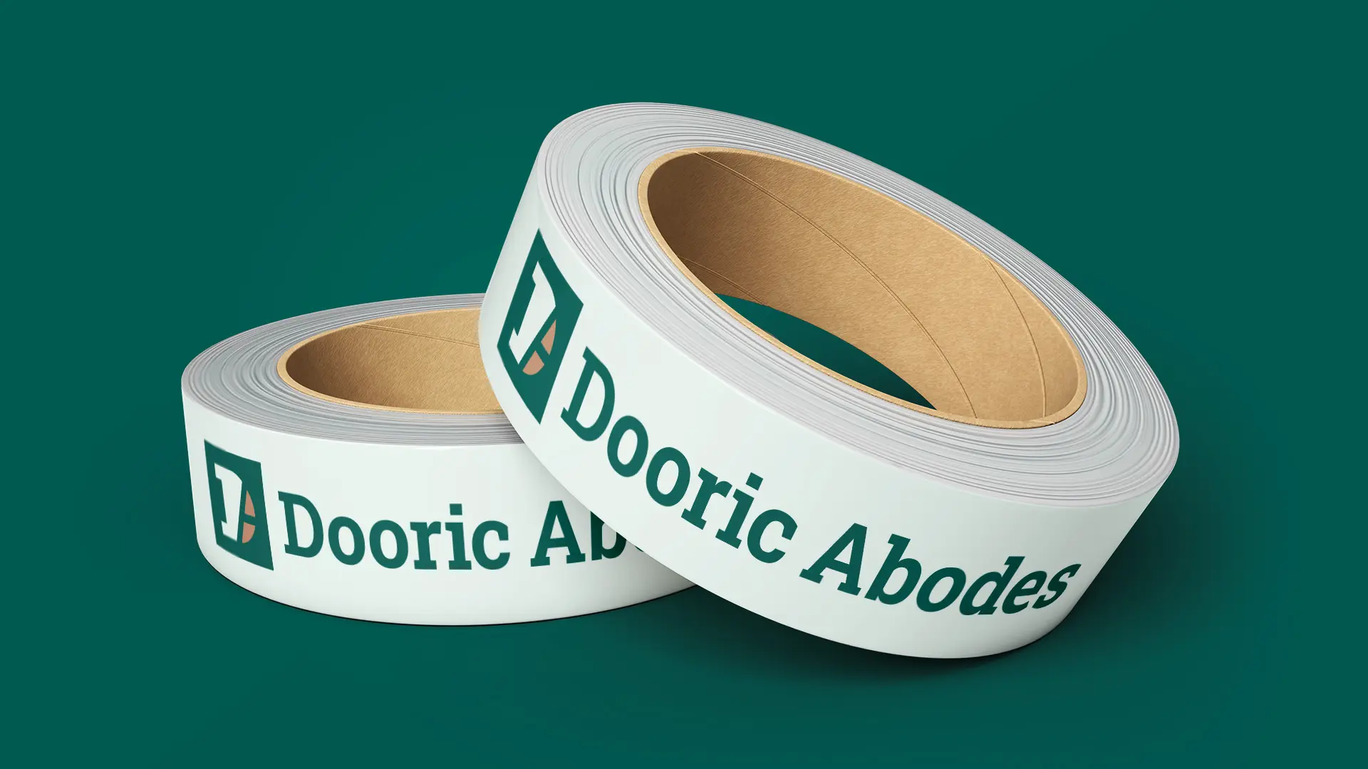
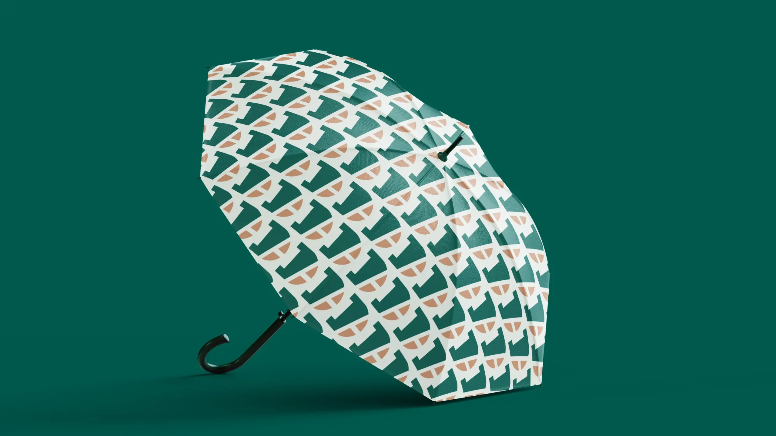
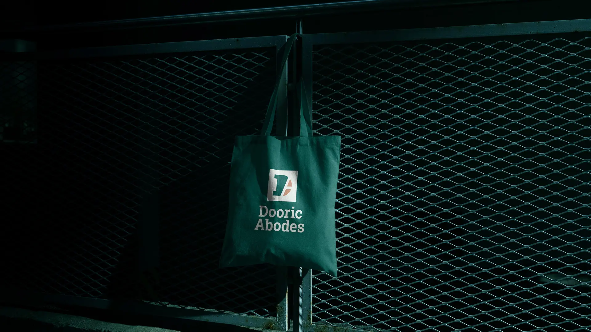
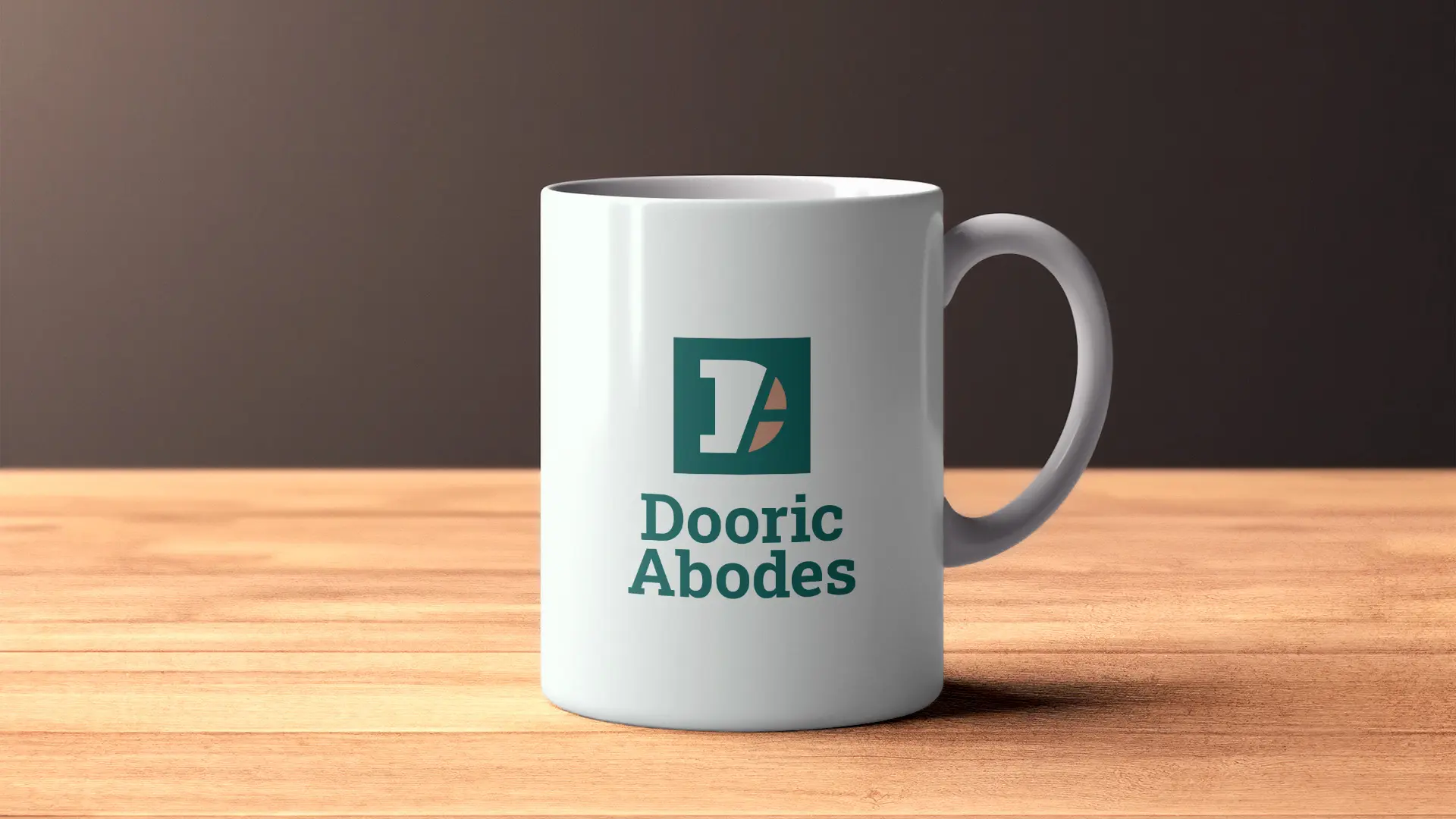
Brand elements: The brand pattern was created to enhance and extend the brand’s visual identity… Used for branded products like umbrellas and on the website to increase brand recognition.


© 2026 Cinnteffective. All Rights Reserved.