Btwn D'Bread
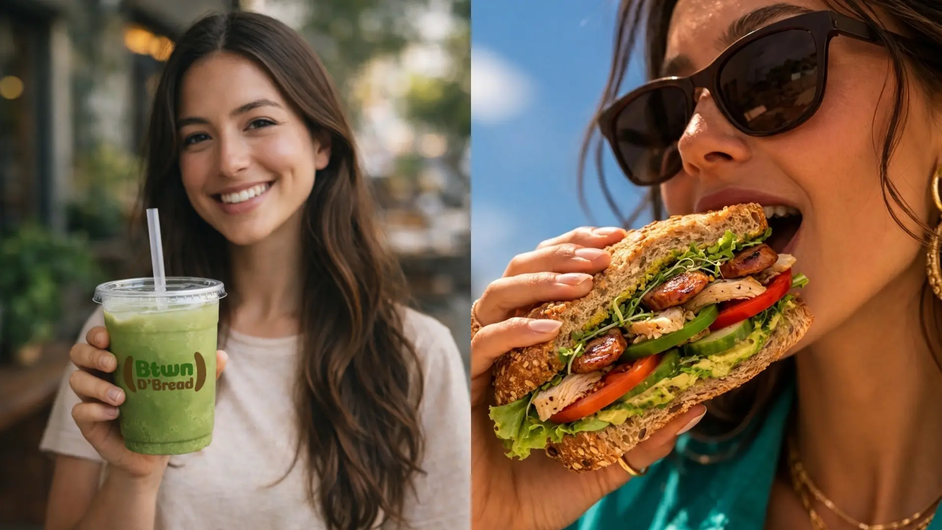
Btwn D’Bread is a health-focused sandwich shop built around one simple belief… eat better, feel better. The shop is on a mission to prove that fast, convenient food can still be real, fresh, and genuinely good for you. Every sandwich is layered with care, built from fresh ingredients, and centered around greens… because great food should nourish you just as much as it satisfies you.
Role
- Brand strategy
- Logo design & visual identity
- Brand collaterals
The Challenge
The sandwich market is busy, and standing out takes more than good food. Btwn D’Bread needed a brand identity that could communicate its health-first philosophy clearly and confidently… attracting customers who are conscious about what they eat without making the brand feel overly clinical or intimidating. The challenge was to build a visual identity that felt fresh, warm, and approachable while staying true to the shop’s emphasis on greens, real ingredients, and intentional eating. The brand needed to feel like a place people genuinely want to eat at… not just a healthy option, but the preferred one.
The Solution
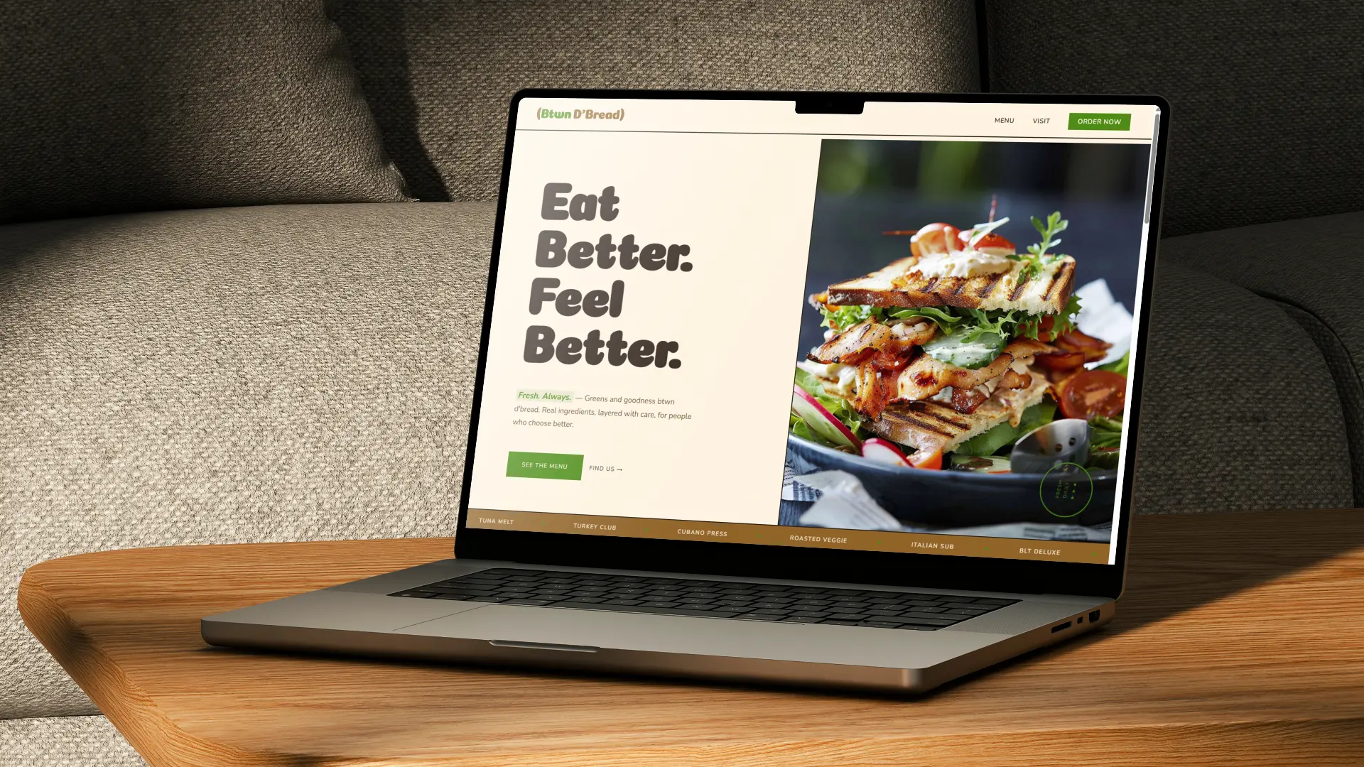
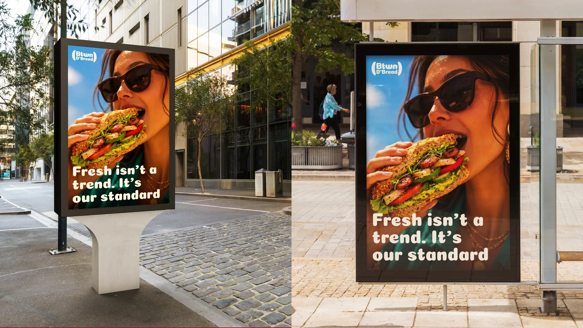
A fresh and grounded brand identity system was built around the core ideas of freshness, nourishment, and real goodness. Every visual decision was made to reflect the shop’s personality… natural, freshness, and full of character.
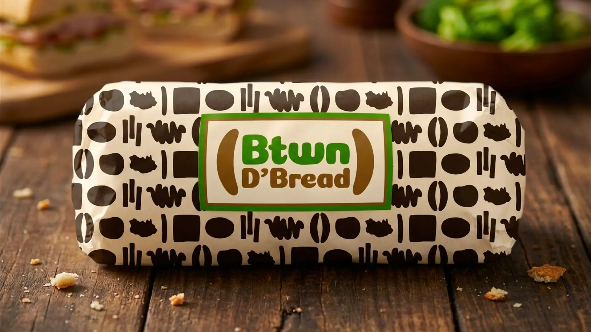
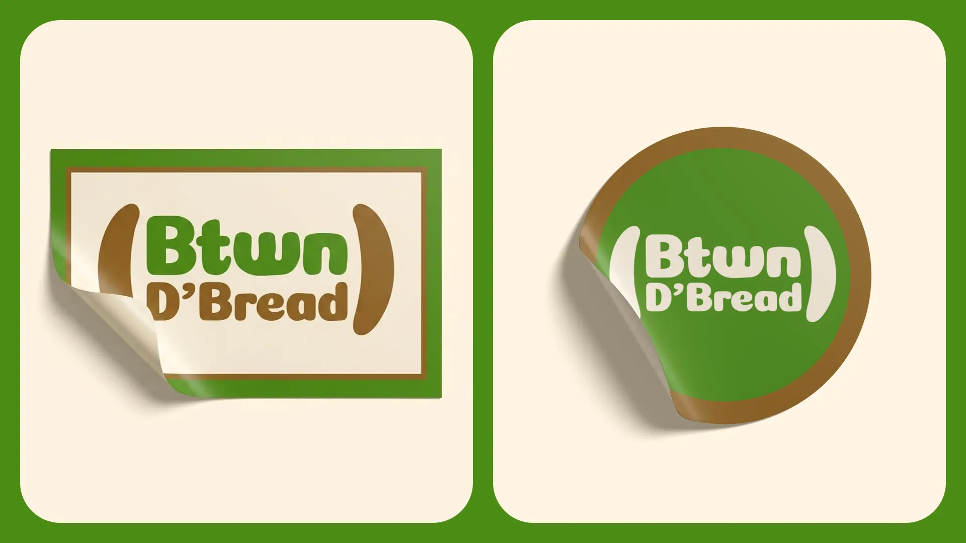
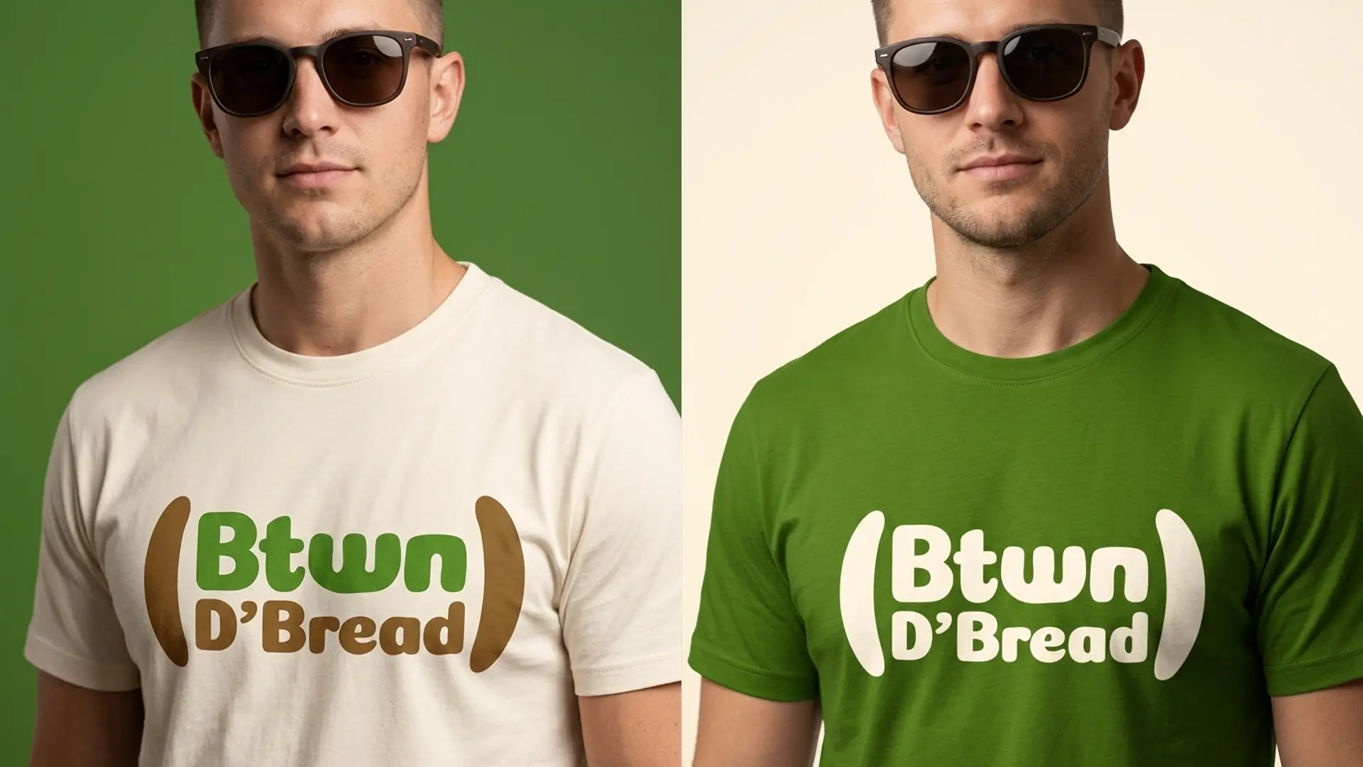
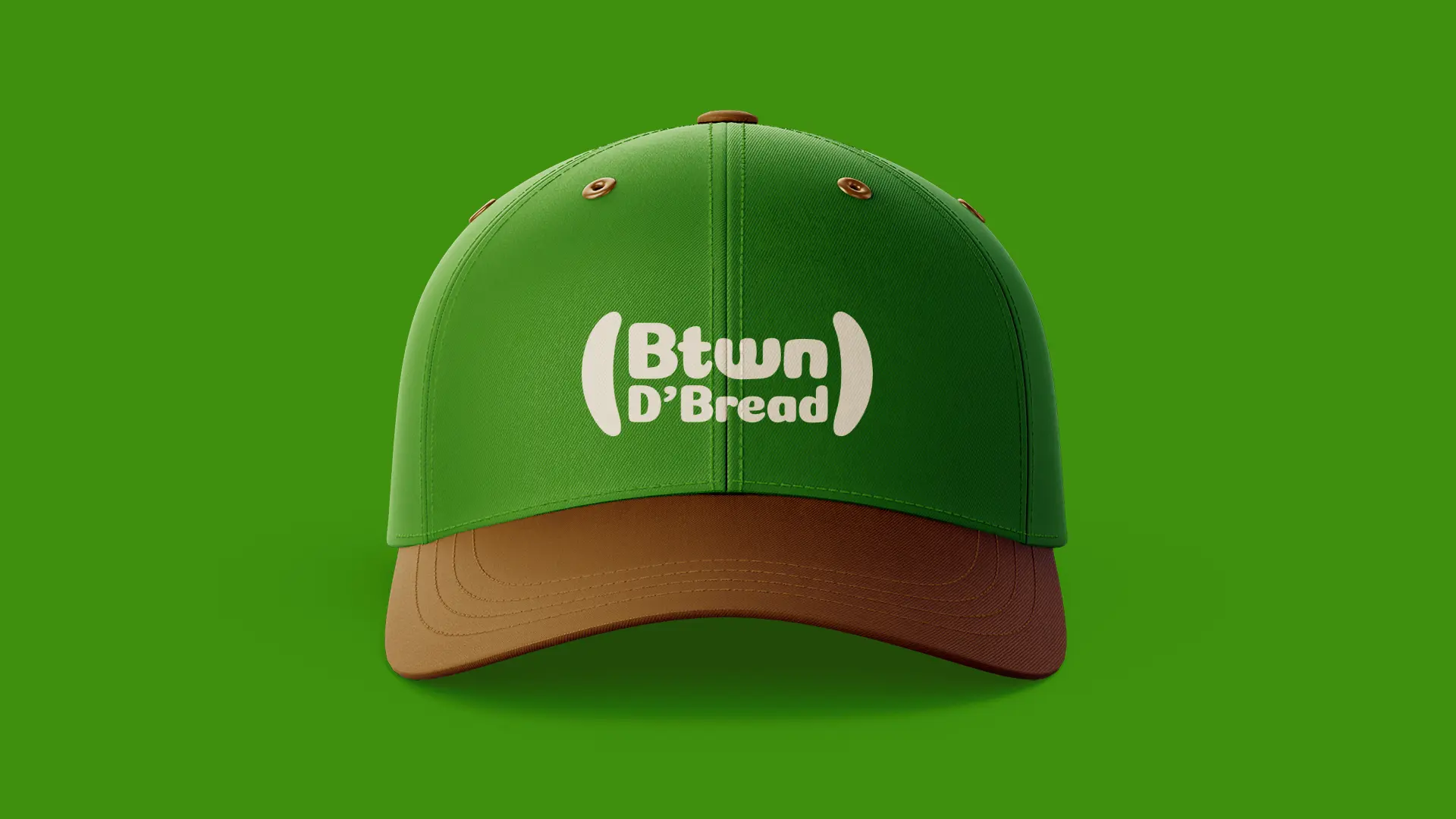
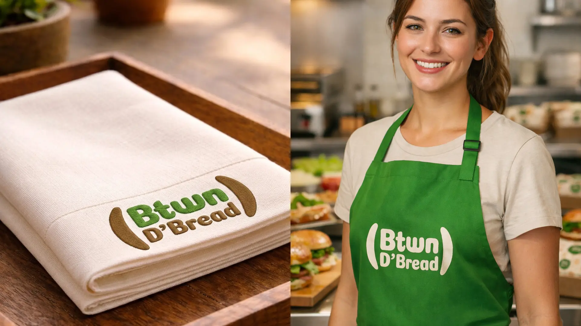
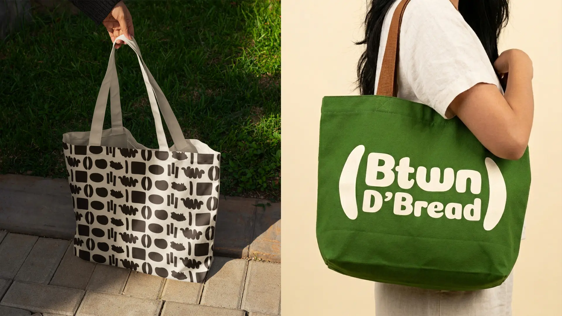
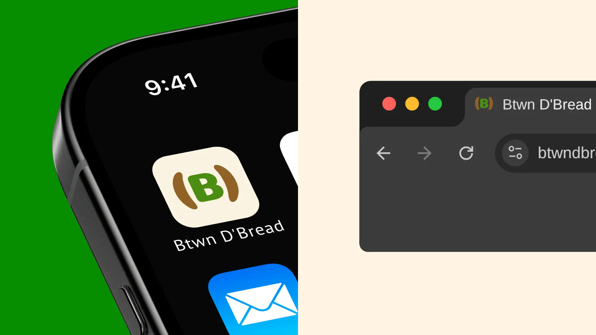
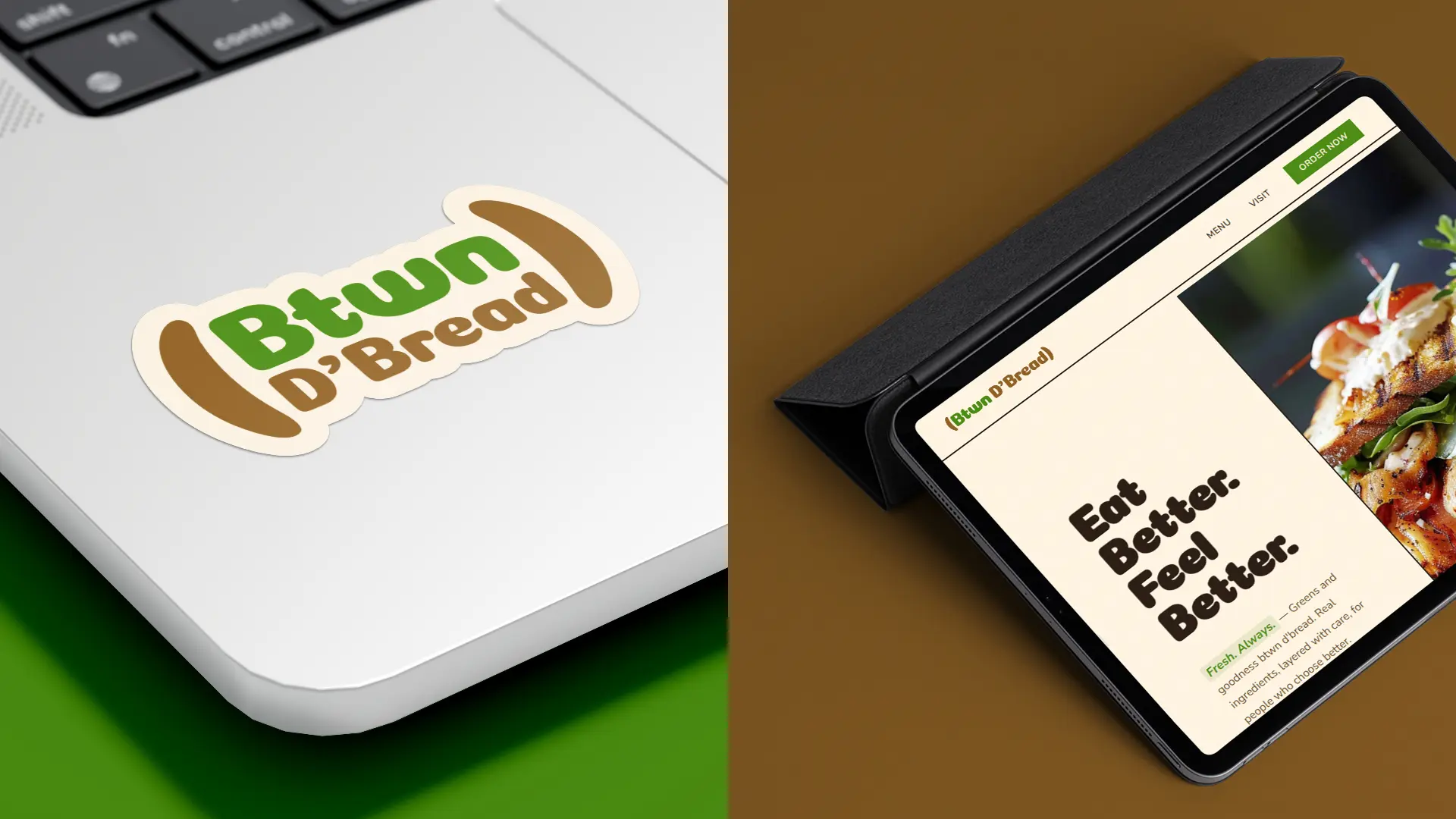
Logo design: The logo is a simple and friendly wordmark with a concept as clever as the brand name itself. The name Btwn D’Bread sits nestled between two bracket-like shapes, visually mirroring the idea of something held between two slices of bread. It is a simple idea executed with precision… the name literally lives between the brackets, just as every great ingredient lives between the bread. The result is a logo that communicates the brand’s identity instantly, with a personality that feels friendly, welcoming, and completely ownable.
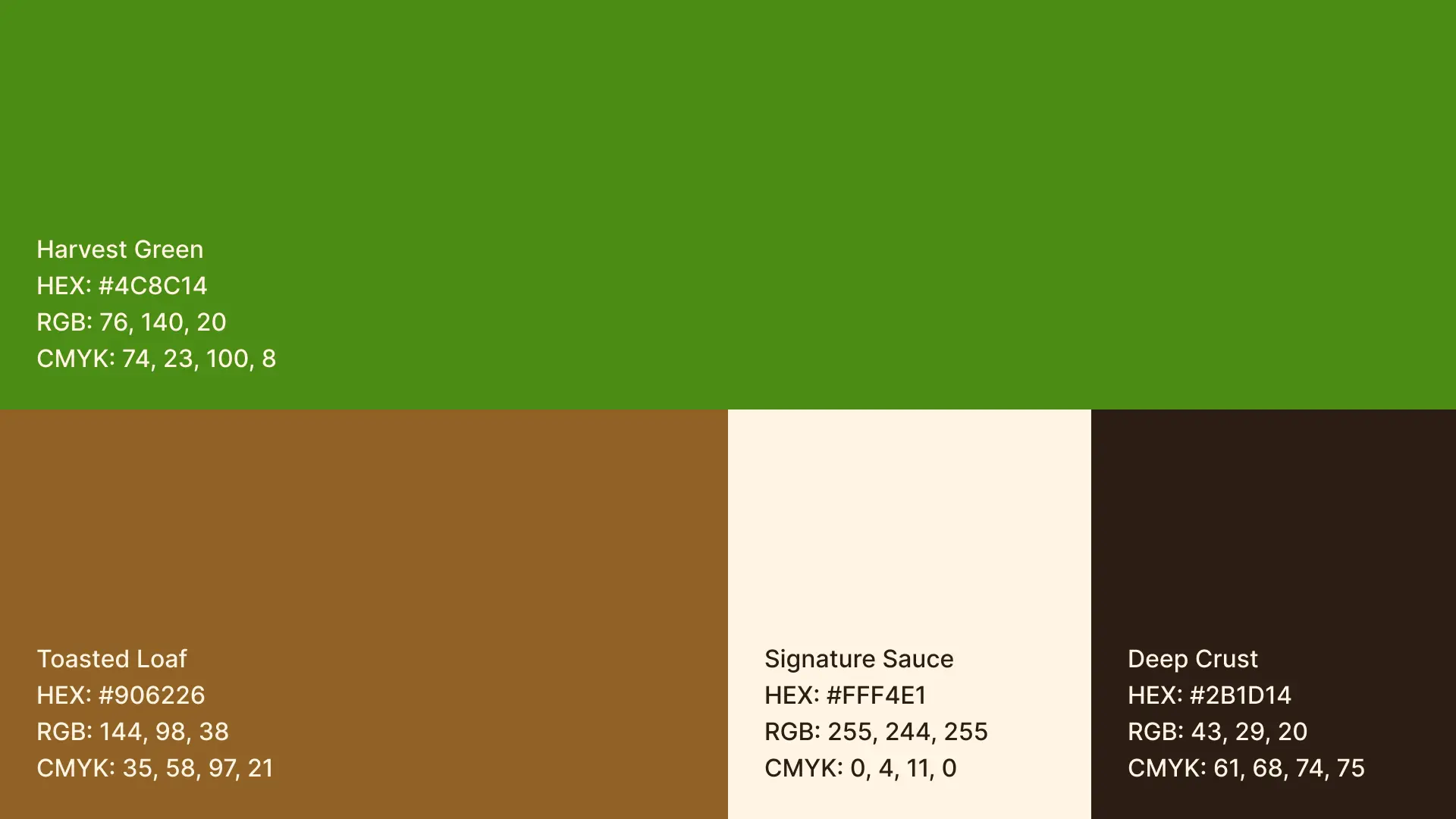
Brand colors: A fresh and grounded color palette was strategically selected to reflect the shop’s focus on real ingredients, natural goodness, and wholesome eating. The palette conveys freshness, warmth, and appetite… perfectly capturing the feeling of something real, nourishing, and made with care.
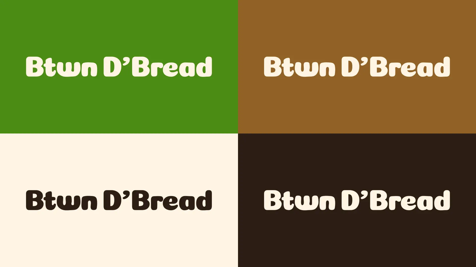
Brand fonts: A bubbly, expressive display font paired with a clean supporting sans serif font was selected to give the brand its personality. The combination feels warm and full of character without losing clarity… reflecting a brand that is approachable, genuine, and a little bit fun. Just like the food.
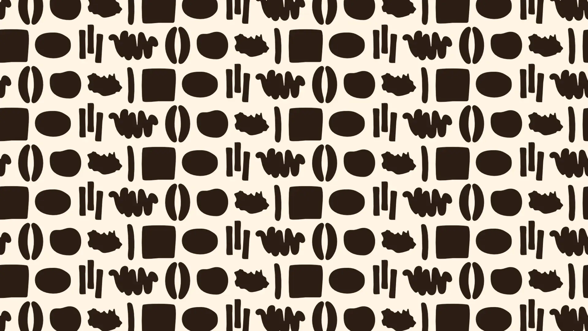
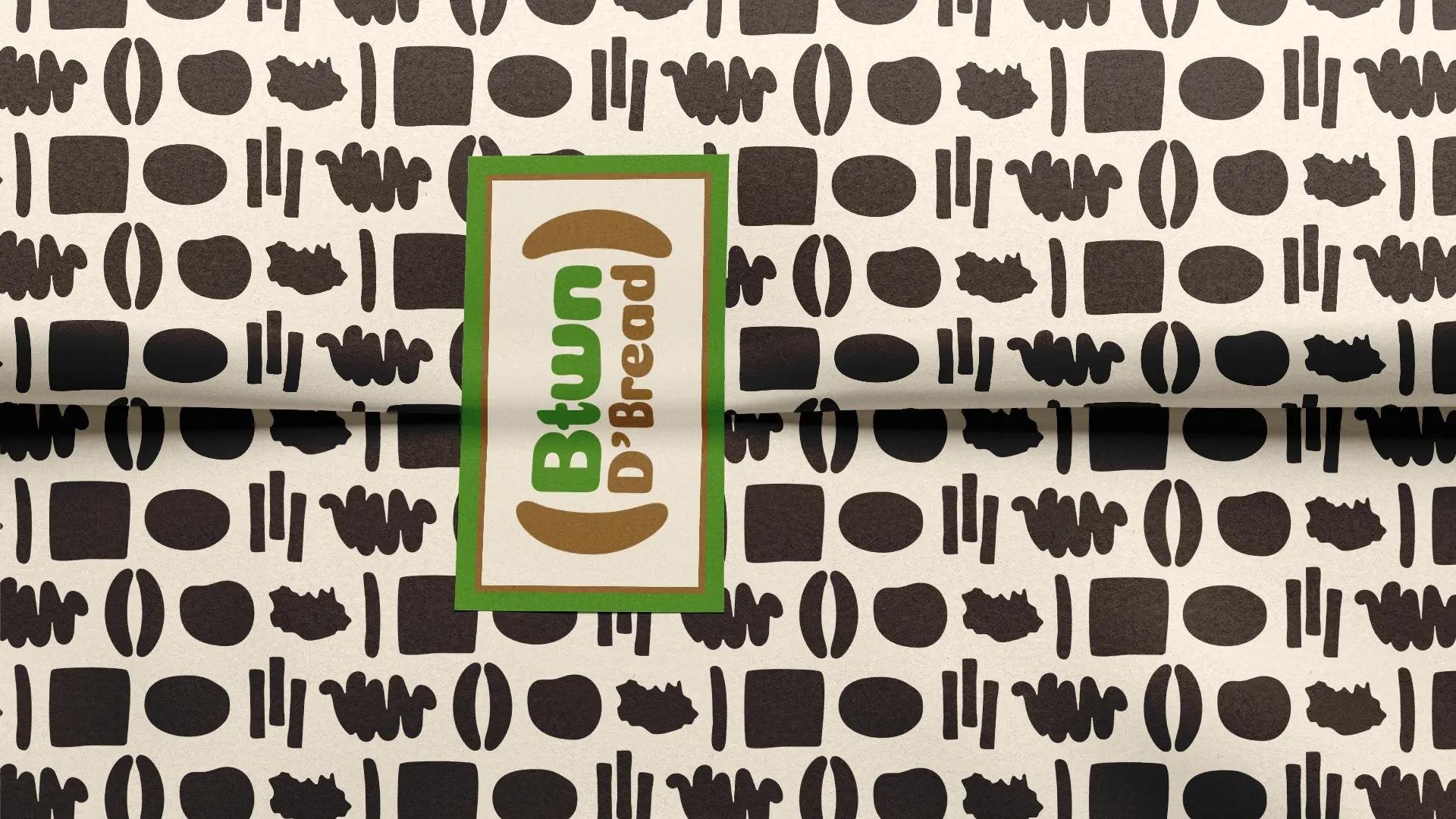
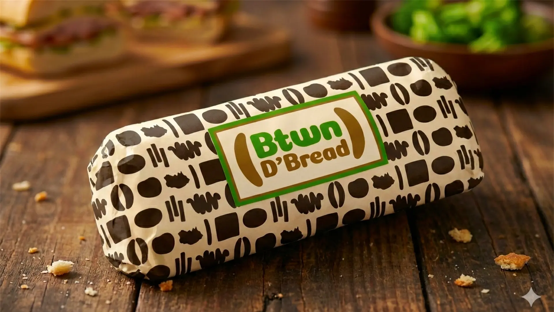
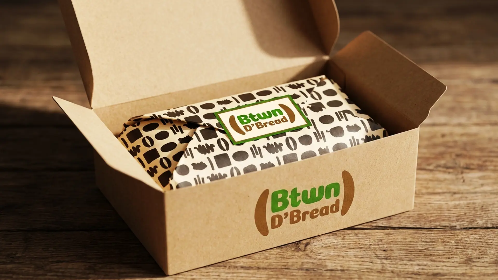
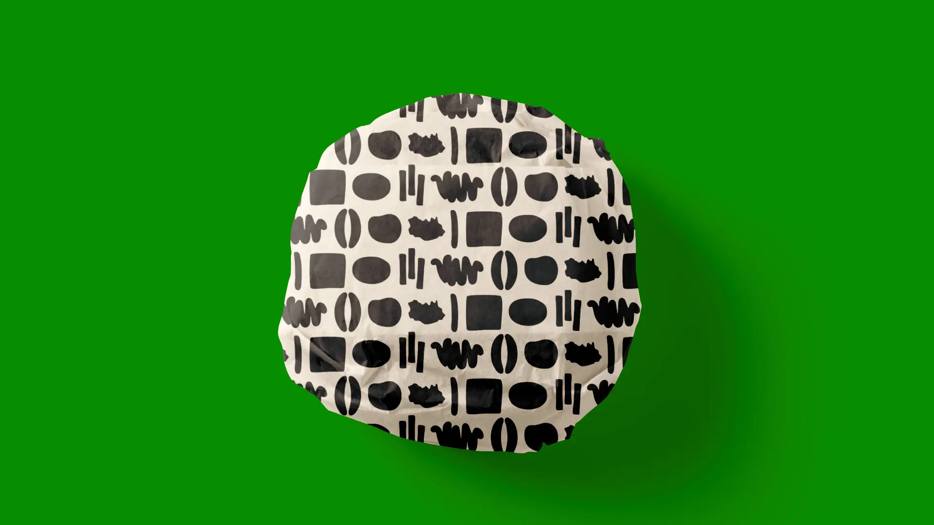
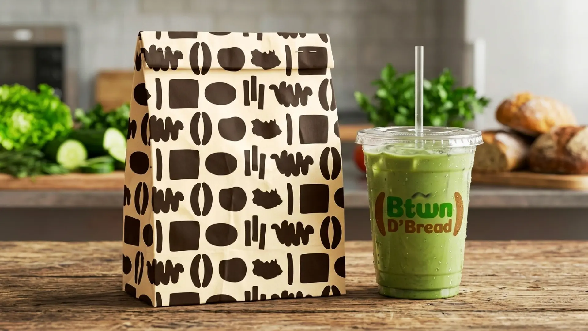
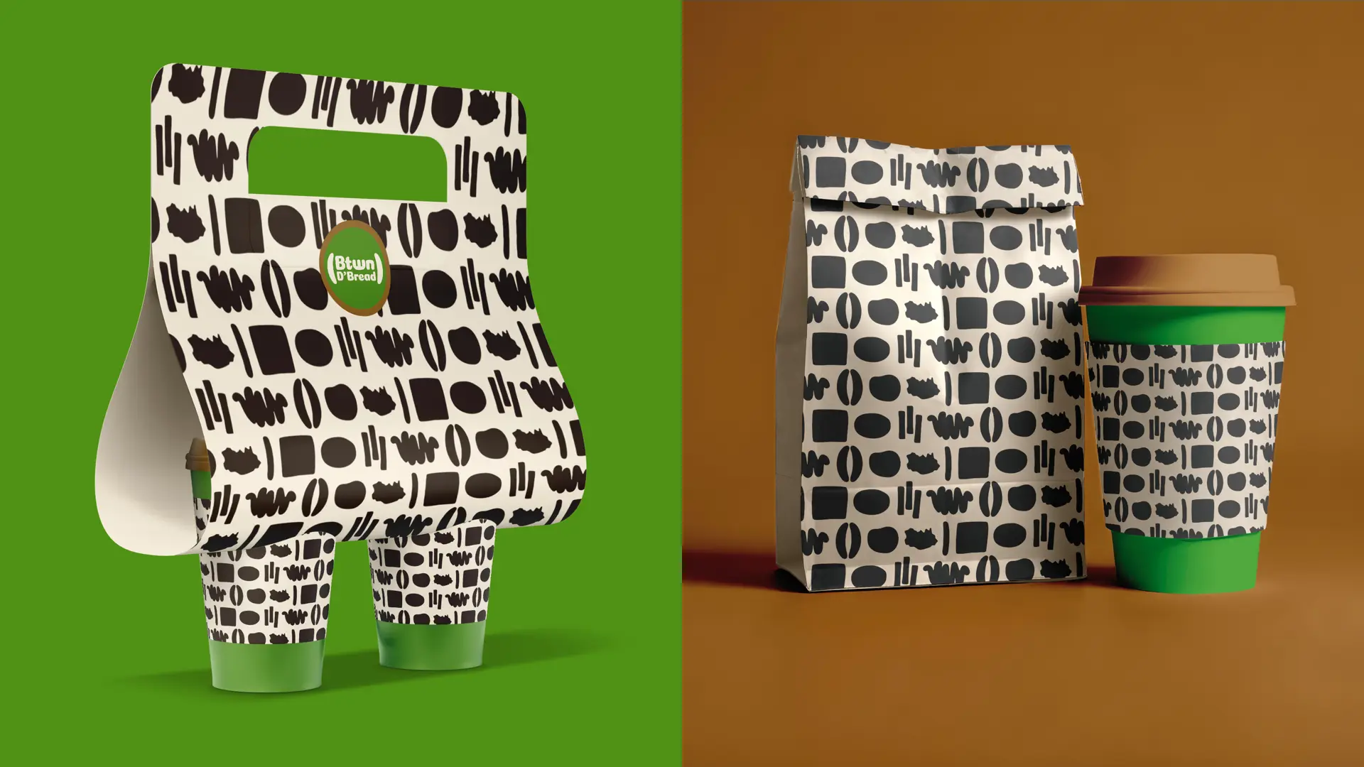
Brand pattern: A brand pattern was developed to bring the Btwn D’Bread identity to life across every surface the brand touches. Inspired by sandwich ingredients, the pattern adds extension and visual consistency to packaging, takeout bags, and wrappers… turning everyday functional items into a recognizable and memorable brand experience.
Brand collateral: The brand identity was extended into a range of everyday items including t-shirts, tote bags, face caps, and towels.. giving the identity a physical presence and ensuring the brand shows up consistently beyond the shop itself.
© 2026 Cinnteffective. All Rights Reserved.